exp(1)[1] 2.718282This chapter aims to immerse the active reader in applied data analysis by providing a brief, fast-paced introduction to both R and basic statistics. As discussed in Appendix C, R is both a programming language and a software environment focused on statistical computing and graphics. Like a natural language, the best way to learn a computer language is to dive in and use it. Unlike a natural language, one can achieve a degree of fluency in a matter of hours. Also as a learner, you do not need to find a native speaker of R willing to tolerate your bad grammar; you can practise R without leaving your computer and get immediate feedback on your attempts.1
As we assume very little here in terms of prior exposure to R or statistics, some points in this chapter may seem a little tedious. But we expect these parts can be covered quickly. We highly recommend that you treat this chapter as a tutorial and work through the code that follows, either by typing or by copying and pasting into the R console (this is what we mean by an “active reader” above). Once you have completed the steps detailed in Section 1.2, the code below should allow you to produce the output below on your own computer in this fashion.2
Some parts of the code may seem a little mysterious or unclear. But just as one does not need to know all the details of the conditional tense in French to use Je voudrais un café, s’il vous plaît, you don’t need to follow every detail of the commands below to get a sense of what they mean and the results they produce (you receive a coffee). For one, most concepts covered below will be examined in more detail in later chapters.
In addition, you can easily find help for almost any task in R’s documentation, other online sources, or in the many good books available on statistical computing (and we provide a guide to further reading at the end of this chapter). Many of the R commands in the online version of this book include links to online documentation.
We believe it is also helpful to note that the way even fluent speakers of computer languages work involves internet searches for things such as “how to reorder column charts using ggplot2” or asking questions on StackOverflow. To be honest, some parts of this chapter were written with such an approach. The path to data science fluency for many surely involves years of adapting code found on the internet to a problem at hand.
As such, our recommendation is to go with the flow, perhaps playing with the code to see the effect of changes or trying to figure out how to create a variant that seems interesting to you. To gain the most from this chapter, you should try your hand at the exercises included in the chapter. As with the remainder of the book, these exercises often fill in gaps deliberately left in the text itself.
R contains a multitude of functions. For example, the exp() function “computes the exponential function”:
exp(1)[1] 2.718282We can access the documentation for exp() by typing help(exp) or ? exp at the console. Looking at that documentation, we see that it has a single argument: x. So we could instead type:
exp(x = 1)[1] 2.718282But with a single argument, there is no reason to do so. In contrast, the documentation for log() shows the form log(x, base = exp(1)). This tells us that log() takes up to two arguments. There is no default for the first argument x, but the second argument (base) has a default of exp(1). So, by default, log() will return the natural logarithm of the value supplied as a first argument.
Function arguments can be matched either by position or by name. In the first and third examples below, we use positional matching; in the second and fourth, we name the arguments. In the first and second examples, by not supplying a second argument, R uses the default of exp(1).
To draw random numbers from the normal distribution, we would use the rnorm() function, which has the form rnorm(n, mean = 0, sd = 1), where n is the size of the sample and mean and sd are the mean and standard deviation of the distribution we are sampling from. If we want to draw a single random number, use the default value for mean, but set sd to 10, we would need to name the second argument.
rnorm(1, sd = 10)[1] -1.2246(Note that you may get a different value here because of the “randomness” inherent in the rnorm() function.)
The base R functions can be supplemented by creating new functions or by loading packages (we will discuss packages shortly). Creating functions is quite straightforward, as can be seen in the following example.3
square <- function(x) {
  x * x
}
We can now call our function like any other function:
square(2)[1] 4square(64)[1] 4096Each function provided by R or a package has documentation that can be accessed using the help function (or its shorthand equivalent ?). Here are a couple of examples that you should try:
help(exp)
? sinWe have already introduced one kind of operator, the assignment operator <-. In other languages (e.g., Python), this operator is written as =. In many contexts, one can use = in place of <-. While you may see R code in the wild using = for assignment, we always use <- in this book. In RStudio, one can use Alt + - (or Cmd + - on MacOS) to get <-. For help with assignment operators, run the following code in your console.
? `<-`As would be expected of any programming language, especially one focused on statistics, R has a full set of arithmetic operators, including +, *, and /.
2 + 2[1] 44 * 3[1] 125 / 2[1] 2.5As an aside, these operators are actually functions behind the scenes and one can access the function-style version by enclosing the operator in backticks:
`*`(4, 3)[1] 12Knowing this can be helpful for getting help on operators (the help for * provides information on other arithmetic operators including ^, %%, and %/%, so we recommend you look at the results of the following command).
? `*`Another class of operators comprises the relational operators, such as >, >=, ==, and !=. As can be seen below, these operators yield either TRUE or FALSE.4
6 > 4[1] TRUE6 < 4[1] FALSE6 == 4[1] FALSE6 != 4[1] TRUE6 == 3 + 3[1] TRUEFALSE == FALSE[1] TRUEFor help with relational operators, run the following code in your console.
? `>`Another class of operators in R are logical operators, including ! (not), & (and), and | (or).
!(6 == 4)[1] TRUE!TRUE[1] FALSETRUE & FALSE[1] FALSETRUE | FALSE[1] TRUEFor help on the logical operators, run the following code in your console.
? `!`A variable can be used to store an object, such as numerical values. We can use the assignment operator <- to store an object in a variable. For example, we can store 3 in the variable v as follows.
v <- 3We can then recover and manipulate this value later.
v[1] 3v * 2.5[1] 7.5Not all objects are simple values like this. We discuss some of the more complex objects that can be created in R below.
Values in R draw on a number of different data types, including the following:
TRUE or FALSE
1 or 2
1.0 or 256.3
"ABC" or "hello" or "123"
Numeric and integer values may appear alike, but we can specify that we mean an integer by appending L to the literal value we type.
1L[1] 1We can use the class() function to determine the data type of a value.
In addition to these basic data types, there are more elaborate types such as dates, timestamps, and so on.
The most basic data structure in R is the vector, which we can think of as an ordered collection of values of a certain data type. Note the value stored in v above and the results of the various calculations we have performed so far are actually vectors. One way to construct multiple-element vectors is using the c() function (here c stands for “combine” or “concatenate”).
c(0, 1, 4, 9, 16, 25)[1] 0 1 4 9 16 25Scalar addition and multiplication work as they do with vectors in linear algebra.5 That is adding a scalar (i.e., a real number) to a vector adds that scalar to each element of the vector; multiplying a vector by a scalar multiplies each element of the vector by the scalar.
Multiplying or adding two vectors means multiplying or adding each element.
v <- c(1, 2, 4, 6)
v
[1] 1 2 4 6v * 2.5[1] 2.5 5.0 10.0 15.0v + 3[1] 4 5 7 9w <- c(1, 2, 3, 4)
v + w[1] 2 4 7 10v * w[1] 1 4 12 24When we mix values of different data types in a single vector, R converts them to the type that can accommodate all values automatically. So, a logical value can be interpreted as an integer (1L for TRUE and 0L for FALSE), an integer can be represented as a numeric value, and a number (e.g., 3.1) can be thought of as a character ("3.1"). The following code demonstrates this: going from one line to the next, we add an element of a different type and the automatic conversion of the previous elements is evident from the output.
c(TRUE)[1] TRUEc(TRUE, 2L)[1] 1 2c(TRUE, 2L, 3.1)[1] 1.0 2.0 3.1c(TRUE, 2L, 3.1, "frog")[1] "TRUE" "2" "3.1" "frog"We can repeat the same idea but using the class() function to identify the data type of a vector explicitly:
[1] "logical"[1] "integer"[1] "numeric"[1] "character"A similar conversion is often performed when we apply functions to vectors. For example, the application of the sum() function to a numeric vector behaves as we would expect.
sum(1:10)[1] 55When the sum() function is applied to a logical vector, the vector is converted to an integer type.
We can access a specific element of a vector using []. For example,
v[1][1] TRUEv[4][1] FALSEAnother key data structure in R is the list, which is a general form of vector in which the various elements need not be of the same type and are often themselves vectors or lists. Lists provide a convenient way to, say, return the results of statistical computations.
Rather than using [] as we did above, we use the [[]] operator to access elements of a list.6 The following code confirms that the first element is still of logical data type, and the fourth element is of type character.
l <- list(TRUE, 1L, 2.1, "frog")
l[[1]]
[1] TRUEl[[4]][1] "frog"class(l[[1]])[1] "logical"class(l[[4]])[1] "character"Elements of a list can be named, which is very useful in many contexts:
[1] "M3GAN" "Magnus" "Hikaru"Alternatively, we can access elements of a list using the $ operator:
players$yob[1] 2022 1990 1987To access the help for [], [[]], and $, use the following command:
? `[`While vectors and lists are the most basic data structures in R, there are others including:
Data structures are a subset of the more general class of objects in R. Another kind of object in R is the function, which we saw earlier.
When you open R, a number of functions are automatically made available, including exp(), log(), and the operators discussed above. But in practice much of the functionality of R is provided by packages.
Some packages are automatically installed with R; others require separate installation. For example, the following code installs the dplyr package (and you would have run a command like this when installing packages to satisfy the requirements listed in Section 1.2).
install.packages("dplyr")Once a package has been installed, it can be loaded into R using the library() function.
Here you might see a mysterious message something like this:
## The following objects are masked from 'package:stats':
##
##     filter, lag
What does this mean? Basically, both the stats package (loaded by default when you start R) and the newly loaded dplyr package contain functions named filter() and lag(). The message tells that the newly loaded functions “mask” the ones from the stats package, so that when you call filter() now, you get the function supplied by the dplyr package.
This illustrates one reason for putting functions in packages: avoiding name conflicts between functions by only loading the packages you need. You can specify warn.conflicts = FALSE in calling library to suppress this message.
While we generally suppress these messages in this book, you should pay attention to them in practice to avoid the possibility of calling a function different from that you intended to call. Of course, R allows you to specify the package from which you want to get a function by appending the package name and :: before the function name (e.g., stats::lag() to get the lag() function from the stats package). In certain contexts (e.g., writing your own R packages), this approach will be highly advisable. For example, see the code for the get_size_rets_monthly() function from the farr package, which we use in Chapter 15.
Because the data frame is such an important data structure in this book, we devote a little more time to it here. Some kind of data frame is a basic feature of any statistical software system. A data frame is a data structure that organizes data into spreadsheet-like tables in which each column represents a variable and each row represents an observation.
Some data frames are made available automatically in R. The data frame iris represents a famous data set used in early research by Ronald Fisher (use ? iris to learn more about this data set).
Using the dim() function, we see that the iris data set has 150 rows and 5 columns.
dim(iris)[1] 150 5Because simply typing iris at the command line would show all 150 rows, we use the head() function to display the first six rows of the data.
head(iris) Sepal.Length Sepal.Width Petal.Length Petal.Width Species
1 5.1 3.5 1.4 0.2 setosa
2 4.9 3.0 1.4 0.2 setosa
3 4.7 3.2 1.3 0.2 setosa
4 4.6 3.1 1.5 0.2 setosa
5 5.0 3.6 1.4 0.2 setosa
6 5.4 3.9 1.7 0.4 setosaWe mentioned above that a data frame can be considered as a list of vectors. We can use this to access the first 6 rows of the second column as follows:
iris[[2]][1:6][1] 3.5 3.0 3.2 3.1 3.6 3.9We can make this more readable by referring to the second column by its name:
iris[["Sepal.Width"]][1:6][1] 3.5 3.0 3.2 3.1 3.6 3.9Additionally, just as with a list, we can use the $ operator to access the second column:
iris$Sepal.Width[1:6][1] 3.5 3.0 3.2 3.1 3.6 3.9Each column of a data frame is a vector, and each vector can be of a different type from the others. The second column is a numeric vector.
class(iris$Sepal.Width)[1] "numeric"From visual inspection, we might expect iris$Species to be a character vector, but it is actually of type factor.
class(iris$Species)[1] "factor"We can use the table() function to get the frequency of each unique value in the Species variable of iris.
table(iris$Species)
    setosa versicolor  virginica
        50         50         50
One innovation made available through the dplyr package is the tibble, which is best viewed as a more modern version of the base R data frame. (data.frame). The Tidyverse website provides more information about tibbles. Most of the data frames we will use in this book are actually tibble objects. We can use the as_tibble() function to create a tibble version of iris:
iris_tbl <- as_tibble(iris)
iris_tbl
# A tibble: 150 × 5
Sepal.Length Sepal.Width Petal.Length Petal.Width Species
<dbl> <dbl> <dbl> <dbl> <fct>
1 5.1 3.5 1.4 0.2 setosa
2 4.9 3 1.4 0.2 setosa
3 4.7 3.2 1.3 0.2 setosa
4 4.6 3.1 1.5 0.2 setosa
5 5 3.6 1.4 0.2 setosa
6 5.4 3.9 1.7 0.4 setosa
7 4.6 3.4 1.4 0.3 setosa
8 5 3.4 1.5 0.2 setosa
9 4.4 2.9 1.4 0.2 setosa
10 4.9 3.1 1.5 0.1 setosa
# ℹ 140 more rowsA tibble does pretty much all the things that a data.frame does, but has certain benefits, such as nicer default printing (no need for head() and the type of each column is indicated at the top).
In this section, we use data on the financial performance and stock price behaviour of Australian banks to introduce some additional basic concepts of R, provide a brief overview of some basic statistics, and showcase some of the data visualization functionality of R.
In addition to dplyr (already loaded above), we will use the farr package, which provides the data we will work with; the ggplot2 package, which provides the plotting functions we use below; the forcats package, which allows us to work with factors (see discussion below); and tidyr, which we use to reshape data frames.
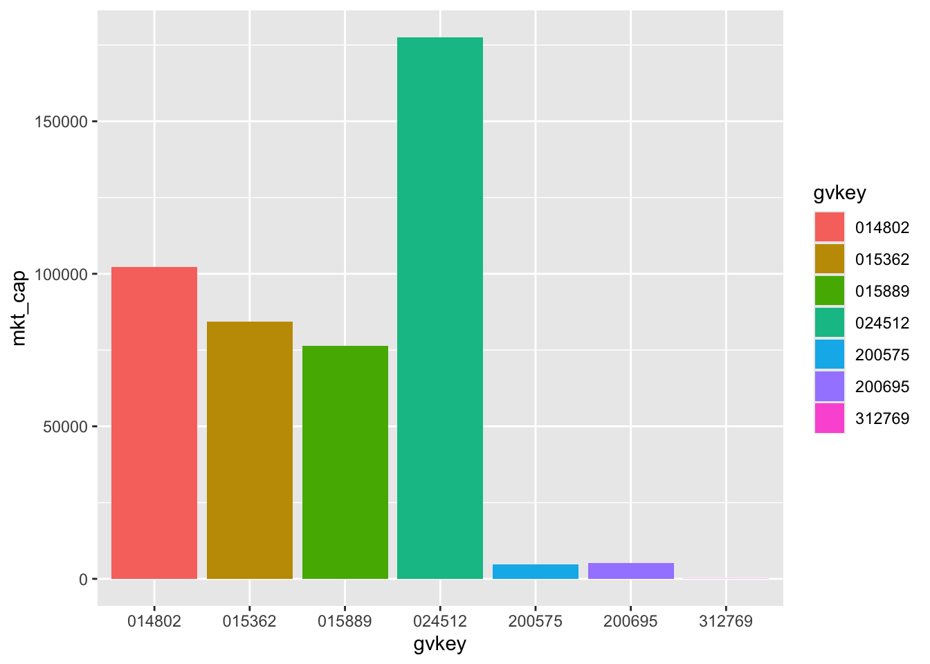
The farr package includes three data frames related to Australian banks. The first is aus_banks, which contains the identifiers (gvkey), tickers, and names of 10 banks.
aus_banks# A tibble: 10 × 3
gvkey ticker co_name
<chr> <chr> <chr>
1 014802 NAB National Australia Bank Ltd
2 015362 WBC Westpac Banking Corp
3 015889 ANZ ANZ Bank New Zealand Limited
4 024512 CBA Commonwealth Bank of Australia
5 200051 ADB Adelaide Bank Ltd
6 200575 BOQ Bank of Queensland Ltd
7 200695 BEN Bendigo and Adelaide Bank Limited
8 203646 SGB St. George Bank Ltd
9 212631 BWA Bank Of Western Australia
10 312769 BBC BNK Banking Corp Ltd The second data frame is aus_bank_funds, which contains selected annual financial statement data for Australian banks. Investors often refer to such information as fundamental data, as it relates to the operating performance of the business that is used in “fundamental” valuation analysis.7
aus_bank_funds# A tibble: 283 × 7
gvkey datadate at ceq ib xi do
<chr> <date> <dbl> <dbl> <dbl> <dbl> <dbl>
1 024512 1987-06-30 43887. 2469. 198. 0 0
2 024512 1988-06-30 50445. 2693. 359. 0 0
3 024512 1989-06-30 60650. 3055 476. 0 0
4 024512 1990-06-30 67030. 3888. 524. 0 0
5 024512 1991-06-30 89292. 4353. 883. 0 0
6 024512 2008-06-30 487572 25619 4791 NA NA
7 024512 1992-06-30 88340. 5471. 409. 0 0
8 024512 1993-06-30 90995. 5569. 443. 0 0
9 024512 1994-06-30 91321. 5965. 682. 0 0
10 024512 1995-06-30 99595 6568. 983. 0 0
# ℹ 273 more rowsThe third data frame is aus_bank_rets, which contains monthly data on stock returns and market capitalization for Australian banks. Note that in aus_bank_rets, as in many financial data sets, a value of 0.148 in ret means that the stock had a 14.8% return for that month.
aus_bank_rets# A tibble: 3,047 × 4
gvkey datadate ret mkt_cap
<chr> <date> <dbl> <dbl>
1 014802 1985-12-31 NA 1527.
2 014802 1986-01-31 0.0833 1655.
3 014802 1986-02-28 0.0977 1828.
4 014802 1986-03-27 0.148 2098.
5 014802 1986-04-30 0.0660 2237.
6 014802 1986-05-30 -0.0464 2133.
7 014802 1986-06-30 -0.0913 1891.
8 014802 1986-07-31 -0.0696 1771.
9 014802 1986-08-29 0.0551 1868.
10 014802 1986-09-30 -0.0299 1813.
# ℹ 3,037 more rowsDescriptions of the variables found in the three data frames are provided in Table 2.1.
| Item | Description |
|---|---|
gvkey |
Firm identifier |
ticker |
Stock exchange ticker |
co_name |
Bank’s name |
ret |
Stock return (monthly) |
mkt_cap |
Market capitalization |
ni |
Net income |
ib |
Income before extraordinary items |
xi |
Extraordinary items |
do |
Discontinued items |
One thing to note about the three data frames is that, while each covers the same Australian banks, they differ significantly in their number of rows, which is a function of how many times each bank is represented in each data frame.
In aus_banks, a bank is shown only once, so there are only 10 rows.8 In contrast, aus_bank_funds has data for each bank for a number of financial years, so it has 283 rows. And aus_bank_rets has data for each bank for a number of months giving it 3047 rows.
Suppose we are interested in making a plot of the market capitalization of Australian banks using the latest available data in aus_bank_rets. We can apply the max() function to the datadate column of aus_bank_rets to determine the meaning of “the latest available data”:
max(aus_bank_rets$datadate)[1] "2022-10-31"This suggests that we want to take a subset of the aus_bank_rets data, having datadate equal to that value (assuming that the latest available date is the same for all the banks in the table). There are a number of ways to do this, but in this book we will focus on approaches based on dplyr.
According to its home page: “dplyr is a grammar of data manipulation, providing a consistent set of verbs that help you solve the most common data manipulation challenges:
mutate() adds new variables that are functions of existing variablesselect() picks variables based on their namesfilter() picks cases based on their valuessummarise() reduces multiple values down to a single summaryarrange() changes the ordering of the rows”These dplyr verbs are functions that take a data frame (whether data.frame or tibble) as an input and return a data frame as output. As such, the dplyr verbs are often used in conjunction with the pipe (|> below).9 The following code takes aus_bank_rets and uses the pipe (|>) to pass this to the filter() function, which returns only those rows satisfying the condition supplied (datadate == max(datadate)).
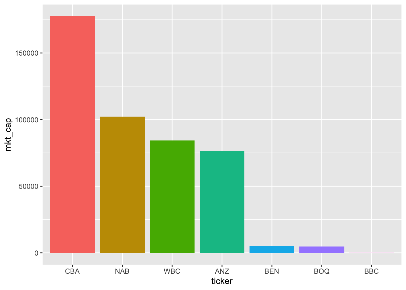
# A tibble: 7 × 4
  gvkey  datadate     ret  mkt_cap
  <chr>  <date>     <dbl>    <dbl>
1 014802 2022-10-31 0.125 102247.
2 015362 2022-10-31 0.168  84412.
3 015889 2022-10-31 0.121  76422.
4 024512 2022-10-31 0.154 177567.
5 200575 2022-10-31 0.168   4765.
6 200695 2022-10-31 0.157   5118.
7 312769 2022-10-31 0.116     74.2
Having identified the data we want for our plot, we next need to pass this to our plotting function. In this book, we will focus on the ggplot2 package for plots. According to its webpage, “ggplot2 is a system for declaratively creating graphics, based on ‘The Grammar of Graphics’ (Wilkinson, 2005). You provide the data, tell ggplot2 how to map variables to aesthetics, what graphical primitives to use, and it takes care of the details.”
In this case, we create a filtered data frame (latest_mkt_cap)
We then pipe this data frame to the ggplot() function. As discussed above, we need to tell ggplot() “how to map variables to aesthetics” using the aes() function inside the ggplot() call. In this case, we put gvkey on the \(x\)-axis, mkt_cap on the \(y\)-axis, and also map gvkey to fill (the colour of the elements) so that each firm has a different colour. We next add (using +) a “layer” using a geom function, in this case geom_col(), which gives us a column graph.10
So we have a plot—Figure 2.1—but a few problems are evident:
014802.Fortunately, all of these problems can be solved.
We start with the first problem. We can use arrange() to see how R thinks about the natural order of our data. The arrange() verb orders the rows of a data frame by the values of selected columns (in this case gvkey).
latest_mkt_cap |>
  arrange(gvkey)
# A tibble: 7 × 4
gvkey datadate ret mkt_cap
<chr> <date> <dbl> <dbl>
1 014802 2022-10-31 0.125 102247.
2 015362 2022-10-31 0.168 84412.
3 015889 2022-10-31 0.121 76422.
4 024512 2022-10-31 0.154 177567.
5 200575 2022-10-31 0.168 4765.
6 200695 2022-10-31 0.157 5118.
7 312769 2022-10-31 0.116 74.2We can now see that the columns are not in a random order, but are arranged in the order of gvkey. The <chr> under gvkey in the output tells us that the column gvkey is of type “character” and so the order is an extended version of alphabetical order.
It turns out that a natural solution to this problem uses what can be considered another data type known as the factor. Factors are useful when a vector represents a categorical variable, especially one with a natural ordering. For example, you have likely encountered a survey where you were given a statement and then asked whether you “strongly disagree”, “disagree”, “neither agree nor disagree” (neutral), “agree”, or “strongly agree” with the statement.
Suppose we have the following (very small) data set with the results of a survey:
If we sort this data set by response, we get the data in alphabetical order, which is not very meaningful.
survey_df |>
  arrange(response)
# A tibble: 10 × 2
participant response
<int> <chr>
1 8 agree
2 9 agree
3 1 disagree
4 6 disagree
5 5 neutral
6 7 neutral
7 2 strongly agree
8 3 strongly agree
9 4 strongly disagree
10 10 strongly disagreeOne option might be to convert the responses to a numerical scale (e.g., “strongly disagree” equals 1 and “strongly agree” equals 5). But this would mean the loss of the underlying descriptive values that are more meaningful for humans. R offers a better approach, which is to encode response as a factor using the factor() function and to indicate the order using the levels argument.
We can use the mutate() verb to replace the existing version of response with a new factor version. The mutate() function can be used to add new variables to a data frame, but new variables will replace existing variables that have the same name. Applying this approach to our survey_df data frame produces data organized in a more meaningful way:
# A tibble: 10 × 2
   participant response
         <int> <fct>
 1           4 strongly disagree
 2          10 strongly disagree
 3           1 disagree
 4           6 disagree
 5           5 neutral
 6           7 neutral
 7           8 agree
 8           9 agree
 9           2 strongly agree
10           3 strongly agree
A logical way to organize the columns of our plot is by market capitalization. We can use arrange(desc(mkt_cap)) to order the data in descending (desc) order of mkt_cap, and then use the function fct_inorder() to create a factor version of gvkey in the same order.
Moving to the next problem, the immediate issue is that we are getting our data from aus_bank_rets, which has no information about the names (or tickers) of the banks in our data. While aus_banks has names and tickers, it lacks data on market capitalization.
In this case, we need to use one of the two-table verbs offered by dplyr. These verbs take two tables as inputs and return as output a single table based on matching values in selected variables across the two tables. We briefly describe four of these verbs here:
inner_join(x, y) only includes observations that match in both x and y. left_join(x, y) includes all observations in x, regardless of whether they have a match in y or not. right_join(x, y) includes all observations in y. It is roughly equivalent to left_join(y, x). full_join(x, y) includes all observations from x and y. Our immediate needs are met with inner_join(), but later in the chapter we will have a use for left_join(). Note that we will generally use the pipe to rewrite (for example) inner_join(x, y) as x |> inner_join(y).
The variables to be used in the match are specified using the by argument. As our matching variable across tables is the firm identifier gvkey, we specify by = "gvkey".
Putting all these pieces together we create a new version of latest_mkt_cap below. Because we don’t need all the variables in our plot, we can use the select() function to keep just the variables we will use. We use the fct_inorder() function to create a factor version of ticker with the levels ordered based on their order in the data, which is in descending order of mkt_cap because of the preceding arrange(desc(mkt_cap)) line.
latest_mkt_cap <-
  aus_banks |>
  inner_join(aus_bank_rets, by = "gvkey") |>
  filter(datadate == max(datadate)) |>
  select(ticker, co_name, mkt_cap) |>
  arrange(desc(mkt_cap)) |>
  mutate(ticker = fct_inorder(ticker))
Having created our data frame, we can pass this to ggplot() again to create Figure 2.2. Note that we specify theme(legend.position = "none") to delete the redundant legend.
Having covered (quickly!) some ground in terms of manipulating data frames and making plots in R, we now move on to some basic statistics. Although we assume little prior knowledge of statistics, our focus in this section is on conducting statistical analysis using R.
The mean of a variable \(x\) in a sample of \(n\) observations is \(\overline{x} = \frac{\sum_{i = 1}^n x_i}{n}\), where \(x_i\) is the value for observation \(i\). We can calculate the sum of a vector using the sum() function and length() gives the number of elements in a vector.11
sum(aus_bank_funds$ib)[1] 520938.7So we can calculate the mean of ib “by hand” as follows:
Of course, R has a built-in mean() function, which we can see produces the same answer.
mean(aus_bank_funds$ib)[1] 1840.773At this point we take a moment for a brief digression about missing values. One thing that you may notice regarding aus_bank_rets is that the first value of ret is NA. The value NA is a special value that indicates a missing value. Values can be missing for many different reasons. In aus_bank_rets, we calculated returns by comparing end-of-month stock prices with beginning-of-month stock prices and adding the value of distributions (e.g., dividends). But there will always be a first month for any given stock, which means we will have missing values for ret in that first month.
Missing values might also arise in survey responses if participants do not complete all questions. Later in this chapter, we see that missing values can also arise when merging different data sets.
The correct handling of missing values is important in many statistical contexts. For example, we might ask participants to indicate their weight (in kilograms). Anne says 51, Bertha says 55, but Charlie does not complete that question. In estimating the average weight of participants, we might ignore the missing case and simply take the average of 51 and 55 (i.e., 53).
But the reality is that we “don’t know” what the average weight of our participants is and in some sense NA is an alternative way of saying “don’t know”. With this interpretation, a single “don’t know” means that aggregated statistics such as sums and means are also “don’t know”. Reflecting its origins in statistics, R is careful about these issues, which we see in its handling of NA values. When asked the mean of weight, R’s response is (in effect) “don’t know”.
mean(survey_data$weight)[1] NAIn the setting above, we might be concerned that Charlie chose not to answer the question about weight because he really let himself go during Covid lockdowns (and thus is above average weight) and feels too embarrassed to answer. In such a case, we would expect a biased estimate of the average weight of participants if we just ignored Charlie’s non-response. But, sometimes we might be willing to make assumptions that make it appropriate to ignore missing values and we can do so by specifying na.rm = TRUE. We will also see a paper studying missing values in Section 8.5.
mean(survey_data$weight, na.rm = TRUE)[1] 53In other contexts, we may use the is.na() function to check whether a value is NA. For example, to create a data frame based on aus_bank_rets, but excluding cases with missing ret values, we could use the following code (note the use of ! to mean “not” ).
# A tibble: 3,037 × 4
   gvkey  datadate       ret mkt_cap
   <chr>  <date>       <dbl>   <dbl>
 1 014802 1986-01-31  0.0833   1655.
 2 014802 1986-02-28  0.0977   1828.
 3 014802 1986-03-27  0.148    2098.
 4 014802 1986-04-30  0.0660   2237.
 5 014802 1986-05-30 -0.0464   2133.
 6 014802 1986-06-30 -0.0913   1891.
 7 014802 1986-07-31 -0.0696   1771.
 8 014802 1986-08-29  0.0551   1868.
 9 014802 1986-09-30 -0.0299   1813.
10 014802 1986-10-31  0.0692   1938.
# ℹ 3,027 more rowsThe median of a variable can be described as the middle value of that variable. When we have an odd number of observations, the median is clear:
median(1:7)[1] 4When there is an even number of observations, some kind of averaging is needed:
median(1:8)[1] 4.5median(aus_bank_funds$ib)[1] 427The median is actually a special case of the more general idea of quantiles:
quantile(aus_bank_funds$ib, probs = 0.5)50%
427 As can be seen in the output above, quantiles are expressed as percentiles (i.e., 0.5 is represented as 50%). In describing a variable, the most commonly cited percentiles (apart from the median) are the 25th and the 75th, which are also known as the first and third quartiles, respectively.
By default, the summary() function produces these three quantiles, the mean, minimum (min()), and maximum (max()) values.
summary(aus_bank_funds$ib) Min. 1st Qu. Median Mean 3rd Qu. Max.
-1562.40 52.56 427.00 1840.77 2882.00 9928.00 The summary() function can also be applied to a data frame.
summary(aus_bank_funds) gvkey datadate at
Length:283 Min. :1987-06-30 Min. :3.900e-01
Class :character 1st Qu.:1998-04-30 1st Qu.:9.227e+03
Mode :character Median :2005-09-30 Median :7.614e+04
Mean :2006-02-12 Mean :2.309e+05
3rd Qu.:2014-06-30 3rd Qu.:3.324e+05
Max. :2022-09-30 Max. :1.215e+06
ceq ib xi do
Min. : 0.333 Min. :-1562.40 Min. :-6068.00 Min. :-6068.00
1st Qu.: 538.762 1st Qu.: 52.56 1st Qu.: 0.00 1st Qu.: 0.00
Median : 4980.000 Median : 427.00 Median : 0.00 Median : 0.00
Mean :14293.539 Mean : 1840.77 Mean : -31.71 Mean : -29.41
3rd Qu.:18843.500 3rd Qu.: 2882.00 3rd Qu.: 0.00 3rd Qu.: 0.00
Max. :78713.000 Max. : 9928.00 Max. : 2175.00 Max. : 2175.00
NA's :117 NA's :117 A bank’s income is likely to be an increasing function of shareholders’ equity. Banks’ return on assets generally come in the form of interest on loans to businesses and consumers, so more assets generally means more income. Assets equal liabilities plus shareholders’ equity and bank regulators normally insist on limits on the amount of assets based on the amount of shareholders’ equity. For these reasons, a common measure of bank performance is return on equity, which we can calculate as roe = ib / ceq.12
summary(aus_bank_roes$roe) Min. 1st Qu. Median Mean 3rd Qu. Max.
-0.23966 0.08563 0.12934 0.11884 0.15560 0.23052 The output from summary() suggests a wide variation in ROE for our banks.
While the output from summary() above is helpful, a more comprehensive representation of the data is provided by the histogram. To produce a histogram for a variable \(x\), we divide the range of values of \(x\) into bins, count the number of observations falling into each bin, and then plot these counts. The histogram is made available via the geom_histogram() function from ggplot2.
Below we specify the width of the bins (binwidth = 0.01) and ggplot2 does the rest. Note that we only specify the x aesthetic because the values on both axes are created from that one data series.
aus_bank_roes |>
  ggplot(aes(x = roe)) +
  geom_histogram(binwidth = 0.01)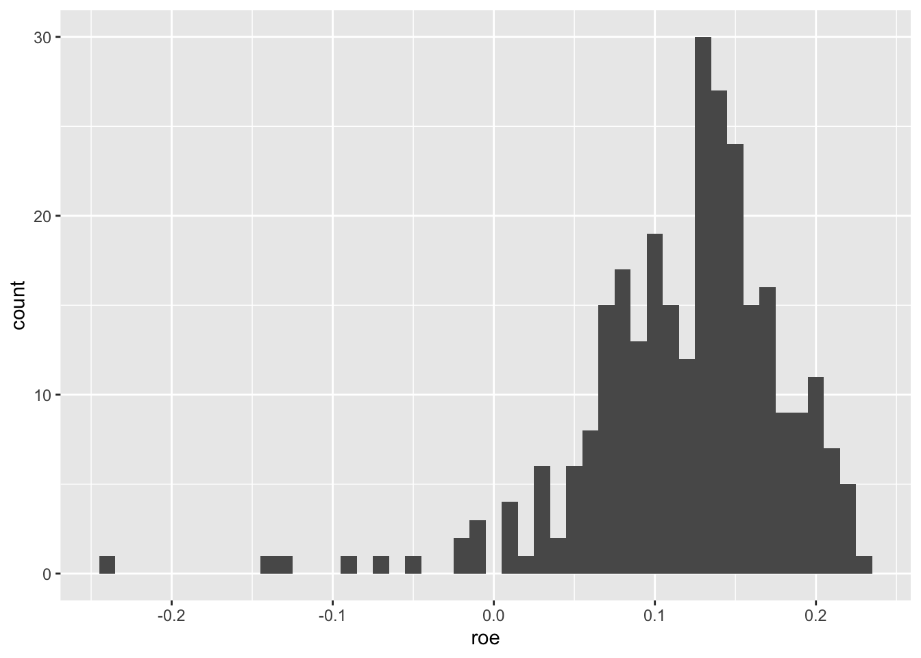
From Figure 2.3, we see that most observations have positive ROE, but there is a long tail of negative ROE firm-years.
The variance of a variable in a sample of \(n\) observations is \(\sigma^2 = \frac{\sum_{i = 1}^n (x_i - \overline{x})^2}{n - 1}\), where \(\overline{x}\) is the mean of \(x\). Note that the denominator is \(n - 1\) rather than \(n\) for statistical reasons that are not important for now.13
We can use this formula to calculate the variance of ib “by hand”:
However, it would be easier to put this formula into a function and use that function.
[1] 6584270We stored our function as var_alt() so that our function doesn’t mask the built-in function var():
var(aus_bank_funds$ib)[1] 6584270The standard deviation is the square root of the variance.
Naturally, R has a built-in function for the standard deviation (sd()).
sd(aus_bank_funds$ib)[1] 2565.983Note that one benefit of the standard deviation is that it is expressed in the same units as the underlying variable (e.g., dollars rather than the dollars-squared in which the variance of ib is expressed).
We will soon see that a lot of research focuses not on how variables vary alone, but on how they vary along with other variables.
For example, we might be interested in how the stock returns for our two largest banks (CBA and NAB) vary together. Here we create a focused data set rets_nab_cba for this purpose.
rets_nab_cba <-
  aus_bank_rets |>
  inner_join(aus_banks, by = "gvkey") |>
  filter(ticker %in% c("CBA", "NAB")) |>
  select(ticker, datadate, ret)

rets_nab_cba
# A tibble: 817 × 3
ticker datadate ret
<chr> <date> <dbl>
1 NAB 1985-12-31 NA
2 NAB 1986-01-31 0.0833
3 NAB 1986-02-28 0.0977
4 NAB 1986-03-27 0.148
5 NAB 1986-04-30 0.0660
6 NAB 1986-05-30 -0.0464
7 NAB 1986-06-30 -0.0913
8 NAB 1986-07-31 -0.0696
9 NAB 1986-08-29 0.0551
10 NAB 1986-09-30 -0.0299
# ℹ 807 more rowsNote that we see a new operator (%in%) that relates to the match() function (type ? match in R for documentation) and whose meaning should be clear from the context.
First, we look at the variance of ret. Running the line below, we should not be surprised that we get the result NA (see discussion of missing values above).
var(rets_nab_cba$ret)[1] NAWe can na.rm = TRUE to calculate a variance omitting missing values.
var(rets_nab_cba$ret, na.rm = TRUE)[1] 0.00357181We can also use the summarize() function, which takes a data frame as input and creates a new data frame with summarized values.
# A tibble: 1 × 1
  var_ret
    <dbl>
1 0.00357
In practice, we are probably less interested in the variance of the returns of all banks considered as a single series than in the variance of returns on a per-stock basis. Fortunately, the group_by() verb from the dplyr package makes this easy. The group_by() function takes an existing data frame and converts it into a grouped data frame so that subsequent operations using summarize() are performed by group. The groups created by group_by() can be removed by applying ungroup() (or by including .groups = "drop" in the call to summarize()).
# A tibble: 2 × 2
  ticker var_ret
  <chr>    <dbl>
1 CBA    0.00326
2 NAB    0.00384
At this stage, readers familiar with SQL will recognize parallels between the verbs from dplyr and elements of SQL, the most common language for interacting with relational databases. We explore these parallels in more depth in Appendix B.
A core concept in measuring how two variables vary together is covariance: \[ \mathrm{cov}(x, y) = \frac{\sum_{i=1}^n (x_i - \overline{x})(y_i - \overline{y})}{n - 1} \]
An issue with the data frame above is that the returns for NAB and CBA for (say) 2022-07-29 are in completely different rows, making it difficult to calculate the covariance between these two sets of returns. Fortunately, we can use the pivot_wider() function from the tidyr package to reorganize the data.
The following code creates two new variables NAB and CBA, representing the returns for NAB and CBA, respectively. The column names come from ticker, and the values from ret. The column datadate serves as the identifier for each row (hence, id_cols = "datadate").
rets_nab_cba_wide <-
  rets_nab_cba |>
  pivot_wider(id_cols = datadate,
              names_from = ticker,
              values_from = ret) |>
  drop_na()

rets_nab_cba_wide
# A tibble: 368 × 3
datadate NAB CBA
<date> <dbl> <dbl>
1 1991-10-31 0.105 0.106
2 1991-12-31 0.0544 0.0703
3 1992-01-31 -0.0476 -0.0758
4 1992-02-28 -0.0171 0.0164
5 1992-03-31 -0.0147 -0.0121
6 1992-04-30 0.0435 0.0576
7 1992-05-29 0.0417 0.0159
8 1992-06-30 -0.00861 -0.0677
9 1992-07-30 0.0376 0.00559
10 1992-08-31 -0.0663 -0.0472
# ℹ 358 more rowsWe will see that calculating the covariance of returns using data in this form will be straightforward. We can easily make a function for calculating the covariance of two variables by translating the formula above into R code (we call it cov_alt() to avoid masking the built-in cov() function).
We can now calculate the covariance of the returns of NAB and CBA:
cov_alt(rets_nab_cba_wide$NAB, rets_nab_cba_wide$CBA)[1] 0.00249763And we can see that this yields the same result as we get from the built-in cov() function:
cov(rets_nab_cba_wide$NAB, rets_nab_cba_wide$CBA)[1] 0.00249763We can even apply cov() to a data frame (note that we drop datadate here using select(-datadate)):
            NAB         CBA
NAB 0.003641643 0.002497630
CBA 0.002497630 0.003279127
A concept that is closely related to covariance is correlation. The correlation of two variables \(x\) and \(y\) is given by the formula
\[ \mathrm{cor}(x, y) = \frac{\mathrm{cov}(x, y)}{\sigma_x \sigma_y} \] where \(\sigma_x\) and \(\sigma_y\) are the standard deviations of \(x\) and \(y\), respectively. The correlation between any two variables will range between \(-1\) and \(1\).
We can calculate the correlation between the returns of CBA and NAB just as we did for the covariance.
cor(rets_nab_cba_wide$NAB, rets_nab_cba_wide$CBA)[1] 0.7227704Like cov(), cor() can be applied to a data frame. Here we calculate the correlation between the returns for all stocks found on latest_mkt_cap:
aus_banks |>
  filter(ticker %in% latest_mkt_cap$ticker) |>
  inner_join(aus_bank_rets, by = "gvkey") |>
  pivot_wider(id_cols = datadate,
              names_from = ticker,
              values_from = ret) |>
  select(-datadate) |>
  cor(use = "pairwise.complete.obs")
NAB WBC ANZ CBA BOQ BEN BBC
NAB 1.0000000 0.74844288 0.76604166 0.72277038 0.5728578 0.51585079 0.16398454
WBC 0.7484429 1.00000000 0.76320108 0.73093523 0.5578418 0.44736669 0.04194391
ANZ 0.7660417 0.76320108 1.00000000 0.70294937 0.4779466 0.48603484 0.08941787
CBA 0.7227704 0.73093523 0.70294937 1.00000000 0.5288250 0.47925147 0.04485547
BOQ 0.5728578 0.55784177 0.47794661 0.52882504 1.0000000 0.63651079 0.11605958
BEN 0.5158508 0.44736669 0.48603484 0.47925147 0.6365108 1.00000000 0.04766109
BBC 0.1639845 0.04194391 0.08941787 0.04485547 0.1160596 0.04766109 1.00000000From the above, you can see that the correlation of any variable with itself is always \(1\).
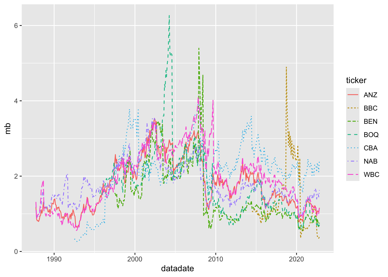
Suppose that we want to create a plot of the market-to-book ratio of each bank, where we define this ratio as mb = mkt_cap / ceq. Clearly, we need to use one of the two-table verbs because mkt_cap is on aus_bank_rets and ceq is on aus_bank_funds.
Here is one approach:
aus_bank_rets |>
  inner_join(aus_bank_funds, by = c("gvkey", "datadate")) |>
  select(gvkey, datadate, mkt_cap, ceq) |>
  mutate(mb = mkt_cap / ceq)
# A tibble: 169 × 5
gvkey datadate mkt_cap ceq mb
<chr> <date> <dbl> <dbl> <dbl>
1 014802 1987-09-30 3382. 2848. 1.19
2 014802 1988-09-30 5076. 4097. 1.24
3 014802 1991-09-30 8806. 7700. 1.14
4 014802 1992-09-30 9145. 7995. 1.14
5 014802 1993-09-30 16519. 8816. 1.87
6 014802 1994-09-30 14125. 9852 1.43
7 014802 1996-09-30 19671. 12519 1.57
8 014802 1997-09-30 30063. 12579 2.39
9 014802 1998-09-30 29516. 15028 1.96
10 014802 1999-09-30 33289. 15845 2.10
# ℹ 159 more rowsThe problem with this approach is that we have just one ratio per year. If you look at the financial pages of a newspaper or financial website, you will see that these provide values of ratios like this as frequently as they provide stock prices. They do this by comparing the latest available data for both fundamentals (here ceq) and stock prices (here mkt_cap). For example, on 28 January 2023, the website of the Australian Stock Exchange (ASX) listed a stock price for CBA of $109.85, and earnings per share of $5.415 for a price-to-earnings ratio of 20.28. The earnings per share number is the diluted earnings per share from continuing operations reported on the face of CBA’s income statement for the year ended 30 June 2022.
We can start the process of constructing something similar by using left_join() in place of the inner_join() we used above.
# A tibble: 2,984 × 5
   gvkey  datadate   mkt_cap   ceq    mb
   <chr>  <date>       <dbl> <dbl> <dbl>
 1 014802 1987-09-30   3382. 2848.  1.19
 2 014802 1987-10-30   2507.   NA  NA
 3 014802 1987-11-27   2712.   NA  NA
 4 014802 1987-12-31   2558.   NA  NA
 5 014802 1988-01-29   2617.   NA  NA
 6 014802 1988-02-29   2677.   NA  NA
 7 014802 1988-03-31   3034.   NA  NA
 8 014802 1988-04-29   3165.   NA  NA
 9 014802 1988-05-31   3716.   NA  NA
10 014802 1988-06-30   4100.   NA  NA
11 014802 1988-07-29   4445.   NA  NA
12 014802 1988-08-31   4689.   NA  NA
13 014802 1988-09-30   5076. 4097.  1.24
14 014802 1988-10-31   4900.   NA  NA
15 014802 1988-11-30   4873.   NA  NA
# ℹ 2,969 more rows
The issue we see now is that most rows have no value for ceq, hence no value for mb. Following the logic applied on the ASX’s website, we want to carry forward the value of ceq until it is updated with new financial statements. To do this, we will use the fill() function from the tidyr package. Once we group_by(gvkey) (to indicate that we only want to “fill” data within a company) and arrange(datadate) (so that R knows the applicable order for the data), we can call fill(ceq, direction = "down") to produce data like the following, which appears to be what we want (compare the output below with that above).
aus_bank_rets |>
  inner_join(aus_banks, by = "gvkey") |>
  filter(ticker %in% latest_mkt_cap$ticker) |>
  left_join(aus_bank_funds, by = c("gvkey", "datadate")) |>
  select(ticker, datadate, mkt_cap, ceq) |>
  group_by(ticker) |>
  arrange(datadate) |>
  fill(ceq, .direction = "down") |>
  ungroup() |>
  mutate(mb = mkt_cap / ceq) |>
  filter(!is.na(mb)) |>
  arrange(ticker, datadate) |>
  print(n = 15)
# A tibble: 2,364 × 5
ticker datadate mkt_cap ceq mb
<chr> <date> <dbl> <dbl> <dbl>
1 ANZ 1987-09-30 3708. 3139. 1.18
2 ANZ 1987-10-30 2708. 3139. 0.863
3 ANZ 1987-11-30 2555. 3139. 0.814
4 ANZ 1987-12-31 2569. 3139. 0.819
5 ANZ 1988-01-29 2495. 3139. 0.795
6 ANZ 1988-02-29 2650. 3139. 0.844
7 ANZ 1988-03-31 2933. 3139. 0.934
8 ANZ 1988-04-29 3016. 3139. 0.961
9 ANZ 1988-05-31 3478. 3139. 1.11
10 ANZ 1988-06-30 3180. 3139. 1.01
11 ANZ 1988-07-29 3429. 3139. 1.09
12 ANZ 1988-08-31 4100. 3139. 1.31
13 ANZ 1988-09-30 4406. 3903. 1.13
14 ANZ 1988-10-31 4572. 3903. 1.17
15 ANZ 1988-11-30 4505. 3903. 1.15
# ℹ 2,349 more rowsNow that the code appears to be working, we can store the result in aus_bank_mb.
aus_bank_mb <-
  aus_bank_rets |>
  inner_join(aus_banks, by = "gvkey") |>
  filter(ticker %in% latest_mkt_cap$ticker) |>
  left_join(aus_bank_funds, by = c("gvkey", "datadate")) |>
  select(ticker, datadate, mkt_cap, ceq) |>
  group_by(ticker) |>
  arrange(datadate) |>
  fill(ceq, .direction = "down") |>
  ungroup() |>
  mutate(mb = mkt_cap / ceq) |>
  filter(!is.na(mb))
Then we can plot the evolution of market-to-book ratios for our banks using geom_line(), as shown in Figure 2.4.
A topic that has received increased attention in the research community in recent years is reproducible research. This is a complex topic and there are various ideas of what it means for research to be reproducible.
One notion is that the results disseminated by a research team should be reproducible by other research teams running similar experiments. If results do not reproduce in this way, their generalizability may be questioned.
Another notion of reproducibility is more narrow. Typically results disseminated by a research team carry the implicit claim that the team took data from certain sources (sometimes these are experiments, but in accounting research, these are often from databases accessible to other researchers) and conducted certain data manipulations and statistical analyses to produce the disseminated results. The applicable notion here is that other researchers should be able to verify the data and code used to produce results, ensuring that the code functions as claimed and produces the same results. This notion of reproducibility underlies policies for sharing code and data, which will be discussed further in Chapter 19.
We bring up the issue of reproducibility so early in the course because we believe an orientation to reproducibility is a habit best formed early in one’s career. Additionally, the tools provided with modern software such as R make the production of reproducible analyses easier than ever.
We also believe that reproducibility is important not only for other researchers, but also for individual researchers over time. Six months after running some numbers in Excel, you may need to explain how you got those numbers, but important steps in the analysis may have been hard-coded or undocumented.
Alternatively, you might run an analysis today and then want to update it in a year’s time as more data become available (e.g., stock prices and fundamentals for 2023). If you have structured your analysis in a reproducible way, this may be as simple as running your code again. But if you copy-pasted data into Excel and used point-and-click commands to make plots, those steps would have to be repeated manually again.
Reproducibility is arguably also important in practice. Checking data and analysis is often a key task in auditing. Reproducible research leaves an audit trail that manual analyses do not.
Reproducibility also fosters learning and collaboration. It is much easier to get feedback from a more experienced researcher or practitioner if the steps are embedded in code. And it is much easier for collaborators to understand what you are doing and suggest ideas if they can see what you have done.
To make it easier for you to get into reproducible research, we have created a Quarto template—available on GitHub—that you can use to prepare your solutions to the exercises below. For reasons of space, we do not provide details on using Quarto, but the Quarto website provides a good starting point and we direct you to other resources in the next section.
Hopefully, the material above provides the fast-paced introduction to data analysis and visualization promised at the opening of the chapter.
Note that our approach here emphasizes approaches using the tidyverse packages, such as dplyr, ggplot, tidyr, and forcats. We emphasize these packages in this course because we believe they provide a cleaner, more consistent, and more modern interface for accomplishing many data tasks than so-called “Base R” approaches do.
Given this emphasis, a natural place to look for further material is the second edition of R for Data Science (“R4DS”) which also emphasizes tidyverse approaches. The content above overlaps with the material from a number of parts of R4DS. Chapters 3 and 5 of R4DS provide more details on the primary dplyr verbs and reshaping data. We briefly introduced functions, which get a fuller treatment in Chapter 27 of R4DS. We also discussed factors (Chapter 16 of R4DS), missing values (Chapter 18 of R4DS), and joins (Chapter 19 of R4DS).
We introduced elements from Base R not covered until much later in R for Data Science. For example, the use of [[ and $ to select elements of a list or a data frame are first seen in Chapter 14 of R4DS. Chapter 27 of R4DS provides an introduction to important elements of Base R.
In accounting and finance research, data visualization seems relatively underutilized. We speculate that there are two reasons for this. First, making plots is relatively difficult with the tools available to most researchers. For example, many researchers appear to use Excel to make plots, but Excel’s plotting functionality is relatively limited and requires manual steps. Second, data visualization is most useful when the goal is to gain genuine insight into real-world phenomena and less useful for finding the statistically significant “results” that are so often sought (we cover this issue in more depth in Chapter 19).
We agree with the authors of R for Data Science that thinking about data visualization forces the analyst to think about the structure of the data in a careful way. Chapters 1, 9, 10, and 11 of R4DS provide more depth on data visualization. We also try to use data visualization throughout this book. An excellent book-length treatment of the topic is provided by Healy (2018).
We discussed reproducible research briefly above and provided a link to a Quarto template for readers to use in completing the exercises below. For reasons of space, we do not discuss Quarto in detail here. Fortunately, Chapter 28 of R4DS provides an introduction to Quarto.
Our expectation and hope is that, by the end of this book, you will have covered almost all the topics addressed by R4DS. But given that R4DS often provides more in-depth coverage than we can here, we recommend that you read that book carefully as you work through this book and we provide guidance to assist the reader in doing this.
Moving beyond the Tidyverse, Adler (2012) continues to provide a solid introduction to R oriented to Base R. A more programming-oriented pre-Tidyverse introduction to R is provided by Matloff (2011). An introduction to programming using R is provided by Grolemund (2014).
We have created Quarto templates that we recommend that you use to prepare your solutions to the exercises in the book. These templates are available at https://github.com/iangow/far_templates/blob/main/README.md. Download the file r-intro.qmd and make sure to save it with a .qmd extension so that when you open it in RStudio, it is recognized as a Quarto document.
Create a function cor_alt(x, y) that uses cov_alt() and var_alt() to calculate the correlation between x and y. Check that it gives the same value as the built-in function cor() for the correlation between ret_nab and ret_cba from rets_nab_cba_wide.
If we remove the drop_na() line used in creating rets_nab_cba_wide, we see missing values for CBA. There are two reasons for these missing values. One reason is explained here, but the other reason is more subtle and relates to how values are presented in datadate. What is the first reason? (Hint: What happened to CBA in 1991?) What is the second reason? How might we use lubridate::ceiling_date(x, unit = "month") to address the second reason? Does this second issue have implications for other plots?
Adapt the code used above to calculate the correlation matrix for the returns of Australian banks to instead calculate the covariance matrix. What is the calculated value of the variance of the returns for NAB?
From the output above, what is the value for the variance of NAB’s returns given by the cov() function applied to rets_nab_cba_wide? Why does this value differ from that you calculated in the previous question?
What do the two-table verbs semi_join() and anti_join() do? In what way do they differ from the two-table verbs listed above? How could we replace filter(ticker %in% latest_mkt_cap$ticker) (see above) with one of these two verbs?
In calculating ROE above, we used ib rather than a measure of “net income”. According to WRDS, “ni [net income] only applies to Compustat North America. Instead use: ni = ib + xi + do.” Looking at the data in aus_bank_funds, does this advice seem correct? How would you check this claim? (Hint: You should probably focus on cases where both xi and do are non-missing and checking more recent years may be easier if you need to look at banks’ financial statements.)
Figure 2.4 is a plot of market-to-book ratios. Another measure linking stock prices to fundamentals is the price-to-earnings ratio (also known as the PE ratio). Typically, PE ratios are calculated as
where
\[ \textrm{Earnings per share} = \frac{\textrm{Net income}}{\textrm{Shares outstanding}} \] So we might write
\[ \textrm{PE} = \frac{\textrm{Stock price} \times \textrm{Shares outstanding}}{\textrm{Net income}} \] What critical assumption have we made in deriving the last equation? Is this likely to hold in practice?Calculating the PE ratio using pe = mkt_cap / ib, create a plot similar to Figure 2.4, but for the PE ratios of Australian banks over time.
Suppose you wanted to produce the plots in the test (market capitalization; market-to-book ratios; histogram of ROE) using Excel starting from spreadsheet versions of the three data sets provided above? Which aspects of the task would be easier? Which would be more difficult? What benefits do you see in using R code as we did above?
Using the documentation from the farr package, describe the contents of the by_tag_year data frame (type help(by_tag_year) or ? by_tag_year after loading the farr package).
Using by_tag_year, create a plot that displays the total number of questions asked across all languages over time.
Produce a plot like the one above, but focused on questions related to R.
If we want to know the popularity of R relative to other languages, we’re probably more interested in a percentage, instead of just the counts. Add a new variable that is the fraction of all questions asked in each year with a specific tag to the data set and plot this variable focused on questions related to R.
Two popular R packages we have used in this chapter—dplyr and ggplot2—also have Stack Overflow tags. Perform the same steps that you did for R above for these two tags to see whether they are growing as well.
Produce a plot that depicts the relative popularity of R, Python, SAS, and Stata over time.
Which language among R, SAS, and Stata has triggered the most questions in the history of Stack Overflow? (Hint: Use the dplyr verbs summarize() and group_by().)
Unfortunately, as with any computer language, R can be a stickler for grammar.↩︎
With a decent internet connection, the steps outlined in Section 1.2 should take less than ten minutes. The idea of allowing the reader to produce all the output seen in this book by copying and pasting the code provided is a core commitment to the reader that we make.↩︎
We are glossing over a lot of details here, such as the fact that we used the assignment operator to store our function in a variable square and that the return value for the function is the last calculation performed. Keep reading to learn about these. We could be explicit about the returned value using return(x * x), but this is not necessary.↩︎
When either side of the comparison is missing (NA), the result is also NA. We discuss missing values in Section 2.3.2.↩︎
See Appendix A for more on linear algebra.↩︎
Note that l[1] and l[4] work here, but each returns a single-element list, rather than the underlying single-element vector stored in the respective position.↩︎
The NA values are missing values, which we discuss in Section 2.3.2.↩︎
Note that a bank will not always have exactly the same name or ticker over time, but this is an issue that we defer to Chapter 7.↩︎
This “native pipe” (|>) was added to R relatively recently and you will often see code using %>%, the pipe from the magrittr package that is made available via dplyr. Both pipes behave similarly in most respects, but there are minor differences.↩︎
The + behaves in many respects like the pipe operator. For discussion of why ggplot2 uses + instead of |> or %>%, see https://community.rstudio.com/t/why-cant-ggplot2-use/4372/7.↩︎
Recall that variables in data frames are actually vectors.↩︎
In practice, it is more common to use either average or beginning shareholders’ equity in the denominator, but this would add complexity that is unhelpful for our current purposes.↩︎
In some texts, you will see \(n\) as the numerator. We use \(n - 1\), as that is what is used by R’s var() function. An intuitive explanation for using \(n - 1\) is that one degree of freedom was used in calculating the mean, so we should subtract one from the denominator.↩︎