from plotnine import ggplot, element_text
from plotnine.data import mtcarsPlease, I Want Some More Labels
This notebook adapts the plotnine gallery example on layered chart labels to the fluent API style.
The Data
mtcars.head()| name | mpg | cyl | disp | hp | drat | wt | qsec | vs | am | gear | carb | |
|---|---|---|---|---|---|---|---|---|---|---|---|---|
| 0 | Mazda RX4 | 21.0 | 6 | 160.0 | 110 | 3.90 | 2.620 | 16.46 | 0 | 1 | 4 | 4 |
| 1 | Mazda RX4 Wag | 21.0 | 6 | 160.0 | 110 | 3.90 | 2.875 | 17.02 | 0 | 1 | 4 | 4 |
| 2 | Datsun 710 | 22.8 | 4 | 108.0 | 93 | 3.85 | 2.320 | 18.61 | 1 | 1 | 4 | 1 |
| 3 | Hornet 4 Drive | 21.4 | 6 | 258.0 | 110 | 3.08 | 3.215 | 19.44 | 1 | 0 | 3 | 1 |
| 4 | Hornet Sportabout | 18.7 | 8 | 360.0 | 175 | 3.15 | 3.440 | 17.02 | 0 | 0 | 3 | 2 |
Build the Caption
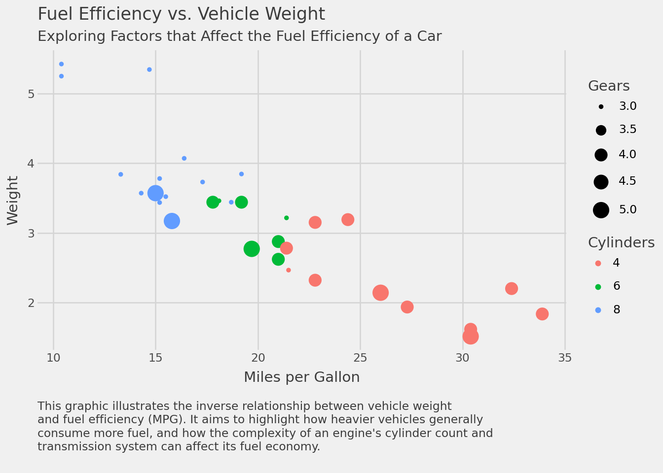
caption = """\
This graphic illustrates the inverse relationship between vehicle weight
and fuel efficiency (MPG). It aims to highlight how heavier vehicles generally
consume more fuel, and how the complexity of an engine's cylinder count and
transmission system can affect its fuel economy.
"""

caption
"This graphic illustrates the inverse relationship between vehicle weight\nand fuel efficiency (MPG). It aims to highlight how heavier vehicles generally\nconsume more fuel, and how the complexity of an engine's cylinder count and\ntransmission system can affect its fuel economy.\n"Add More Labels
(
    ggplot(mtcars)
    .aes("mpg", "wt", colour="factor(cyl)", size="gear")
    .geom_point()
    .xlab("Miles per Gallon")
    .labs(
        y="Weight",
        colour="Cylinders",
        size="Gears",
        title="Fuel Efficiency vs. Vehicle Weight",
        subtitle="Exploring Factors that Affect the Fuel Efficiency of a Car",
        caption=caption,
    )
    .theme_538()
    .add_theme(
        # Left-justify the caption and separate it from the x-axis label.
        plot_caption=element_text(
            ha="left",
            margin={"t": 1, "units": "lines"},
            linespacing=1.25,
        )
    )
)