import polars as pl
import plotnine as p9
from plotnine import aes, ggplotA Bar Plot With 2 Variables
This notebook adapts the plotnine gallery example on grouped bar labels, using Polars for data preparation and the fluent API for plotting.
Visualizing a variable that contains nested, independent categories on a single plot can get crowded quickly. This example builds the chart up step by step.
Create the Data
df = pl.DataFrame(
    {
        "variable": [
            "gender",
            "gender",
            "age",
            "age",
            "age",
            "income",
            "income",
            "income",
            "income",
        ],
        "category": [
            "Female",
            "Male",
            "1-24",
            "25-54",
            "55+",
            "Lo",
            "Lo-Med",
            "Med",
            "High",
        ],
        "value": [60, 40, 50, 30, 20, 10, 25, 25, 40],
    }
).with_columns(
    pl.col("variable").cast(pl.Enum(["gender", "age", "income"])),
    pl.col("category").cast(
        pl.Enum(["Female", "Male", "1-24", "25-54", "55+", "Lo", "Lo-Med", "Med", "High"])
    ),
)

df
shape: (9, 3)
| variable | category | value |
|---|---|---|
| enum | enum | i64 |
| "gender" | "Female" | 60 |
| "gender" | "Male" | 40 |
| "age" | "1-24" | 50 |
| "age" | "25-54" | 30 |
| "age" | "55+" | 20 |
| "income" | "Lo" | 10 |
| "income" | "Lo-Med" | 25 |
| "income" | "Med" | 25 |
| "income" | "High" | 40 |
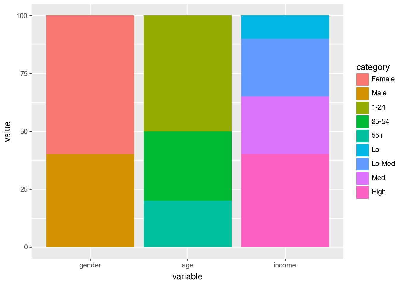
Start With a Simple Bar Chart
(
    ggplot(df)
    .aes(x="variable", y="value", fill="category")
    .geom_col()
)
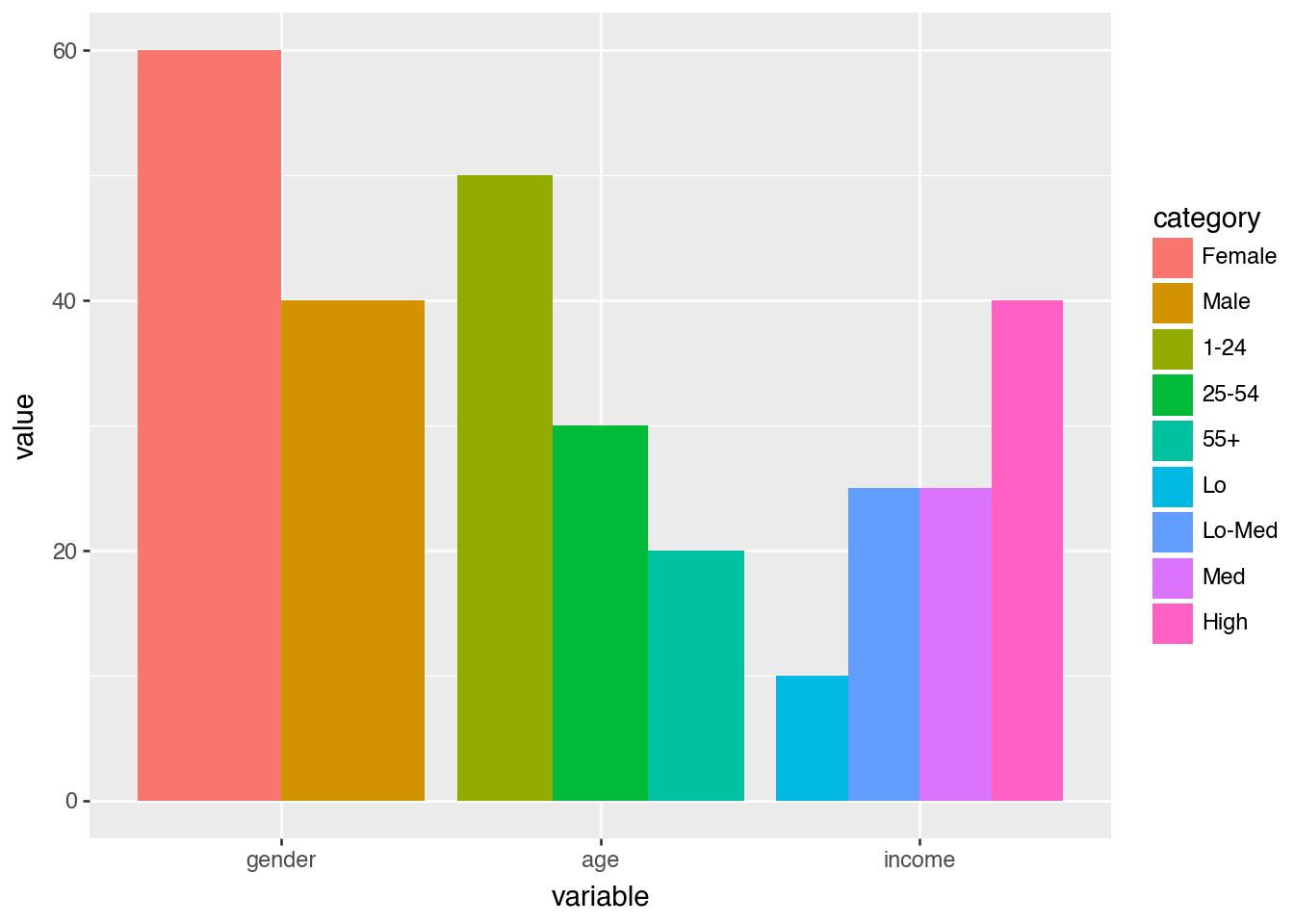
Dodge the Bars
(
    ggplot(df)
    .aes(x="variable", y="value", fill="category")
    .geom_col(position="dodge")
)
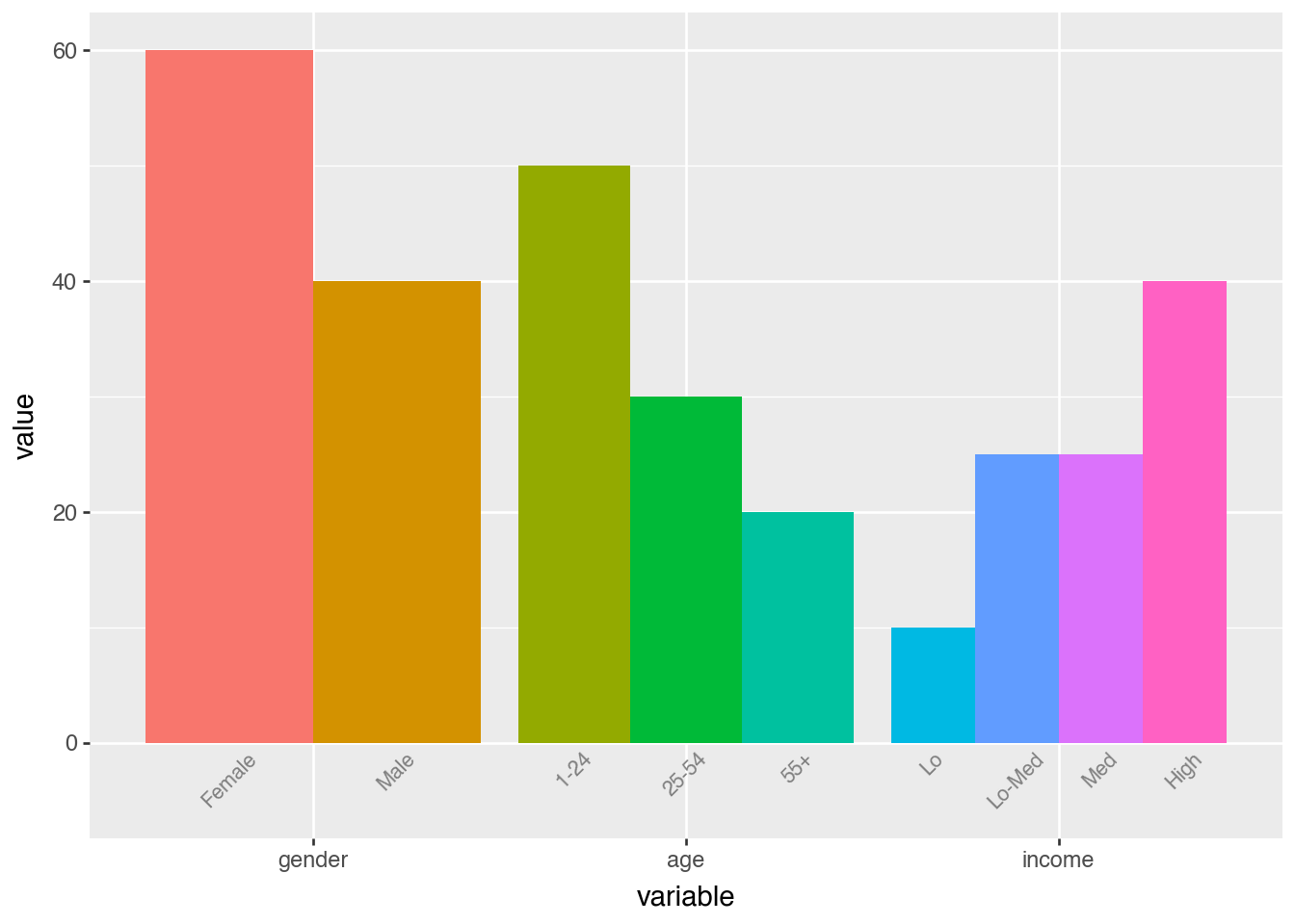
Label Each Category
dodge_text = p9.position_dodge(width=0.9)

(
    ggplot(df)
    .aes(x="variable", y="value", fill="category")
    .geom_col(position="dodge", show_legend=False)
    .geom_text(
        aes(y=-0.5, label="category"),
        position=dodge_text,
        color="gray",
        size=8,
        angle=45,
        va="top",
    )
    .lims(y=(-5, 60))
)
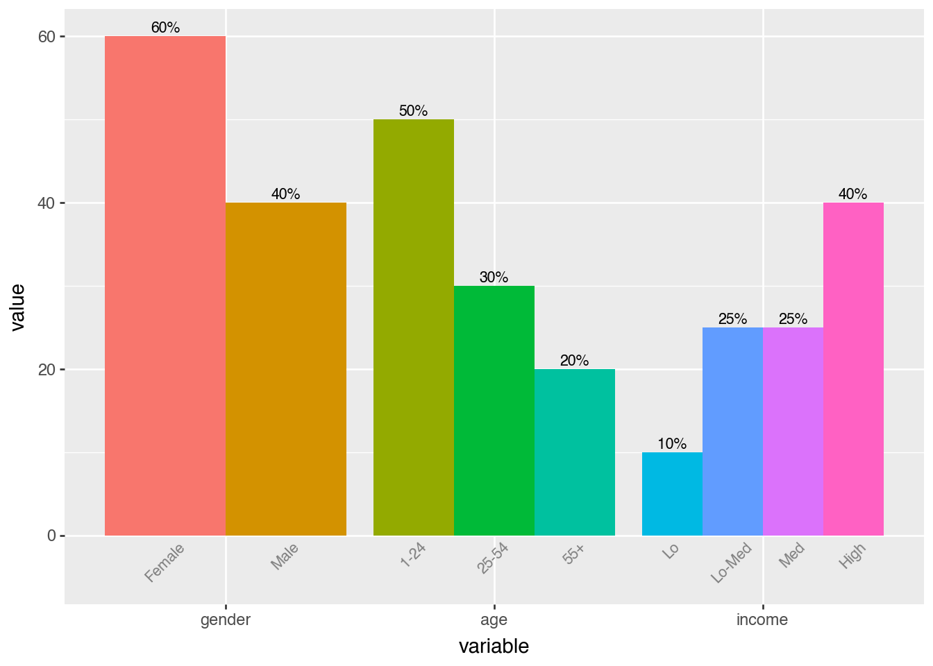
Add Value Labels
dodge_text = p9.position_dodge(width=0.9)

(
    ggplot(df)
    .aes(x="variable", y="value", fill="category")
    .geom_col(position="dodge", show_legend=False)
    .geom_text(
        aes(y=-0.5, label="category"),
        position=dodge_text,
        color="gray",
        size=8,
        angle=45,
        va="top",
    )
    .geom_text(
        aes(label="value"),
        position=dodge_text,
        size=8,
        va="bottom",
        format_string="{}%",
    )
    .lims(y=(-5, 60))
)
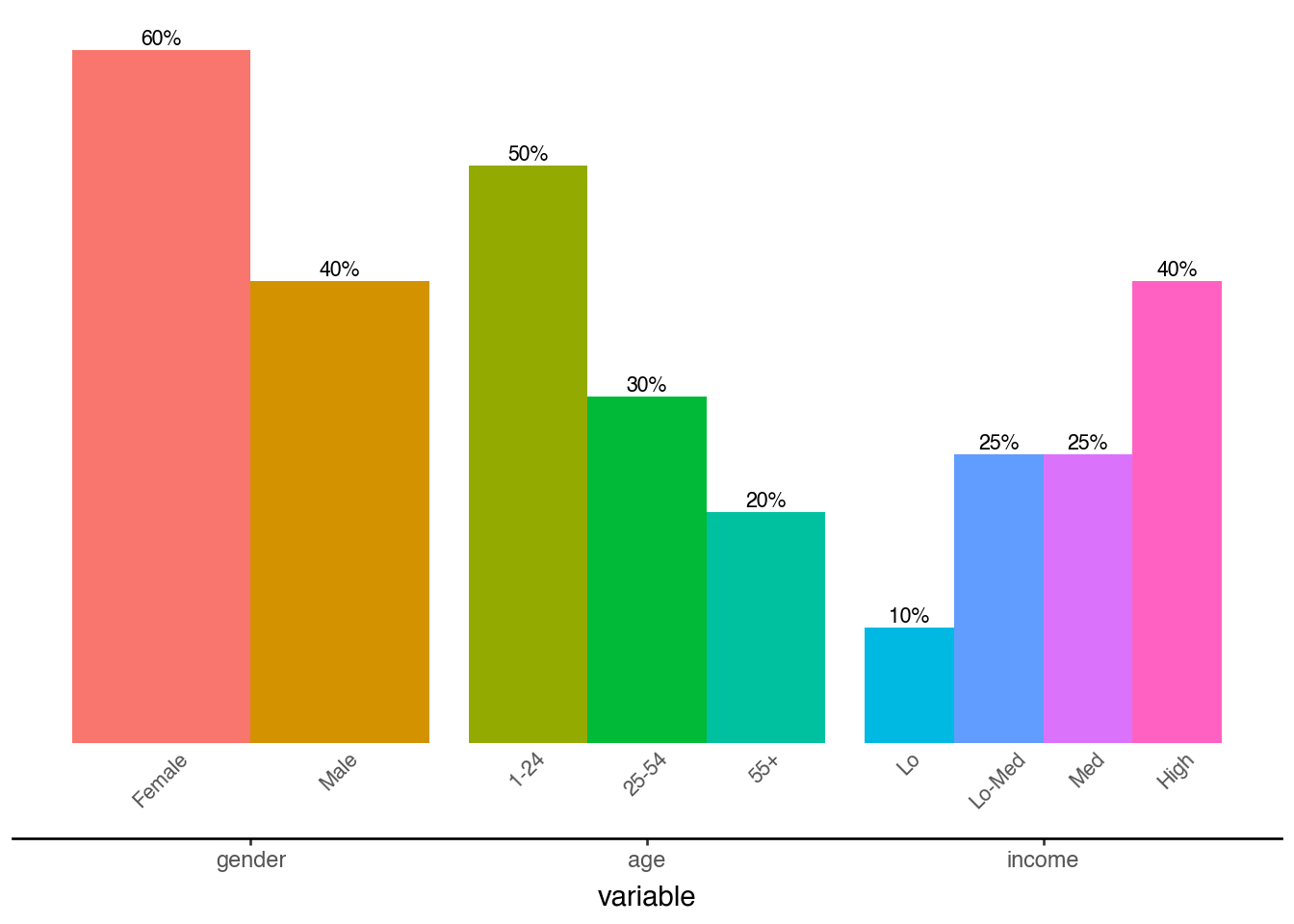
Final Polish
dodge_text = p9.position_dodge(width=0.9)
ccolor = "#555555"

(
    ggplot(df)
    .aes(x="variable", y="value", fill="category")
    .geom_col(position="dodge", show_legend=False)
    .geom_text(
        aes(y=-0.5, label="category"),
        position=dodge_text,
        color=ccolor,
        size=8,
        angle=45,
        va="top",
    )
    .geom_text(
        aes(label="value"),
        position=dodge_text,
        size=8,
        va="bottom",
        format_string="{}%",
    )
    .lims(y=(-5, 60))
    .add_theme(
        panel_background=p9.element_rect(fill="white"),
        axis_title_y=p9.element_blank(),
        axis_line_x=p9.element_line(color="black"),
        axis_line_y=p9.element_blank(),
        axis_text_y=p9.element_blank(),
        axis_text_x=p9.element_text(color=ccolor),
        axis_ticks_major_y=p9.element_blank(),
        panel_grid=p9.element_blank(),
        panel_border=p9.element_blank(),
    )
)