import polars as pl
import plotnine as p9
from plotnine import ggplot, aes
from plotnine.data import diamonds, huron, mpgGeometric Objects
This notebook adapts the plotnine guide on geometric objects to the fluent API style. Where the original page uses pandas-based wrangling, this version uses Polars.
Setup
mpg = pl.from_pandas(mpg)
huron = pl.from_pandas(huron)
diamonds = pl.from_pandas(diamonds)

mpg.head()
shape: (5, 11)
| manufacturer | model | displ | year | cyl | trans | drv | cty | hwy | fl | class |
|---|---|---|---|---|---|---|---|---|---|---|
| str | str | f64 | i64 | i64 | str | str | i64 | i64 | str | str |
| "audi" | "a4" | 1.8 | 1999 | 4 | "auto(l5)" | "f" | 18 | 29 | "p" | "compact" |
| "audi" | "a4" | 1.8 | 1999 | 4 | "manual(m5)" | "f" | 21 | 29 | "p" | "compact" |
| "audi" | "a4" | 2.0 | 2008 | 4 | "manual(m6)" | "f" | 20 | 31 | "p" | "compact" |
| "audi" | "a4" | 2.0 | 2008 | 4 | "auto(av)" | "f" | 21 | 30 | "p" | "compact" |
| "audi" | "a4" | 2.8 | 1999 | 6 | "auto(l5)" | "f" | 16 | 26 | "p" | "compact" |
Basic Use
Geom functions determine how mapped data becomes visible marks. Layers are drawn in the order they are added.
(
    ggplot(mpg)
    .aes("displ", "hwy")
    .geom_point(aes(fill="class"), size=5)
    .geom_point(aes(shape="class"))
)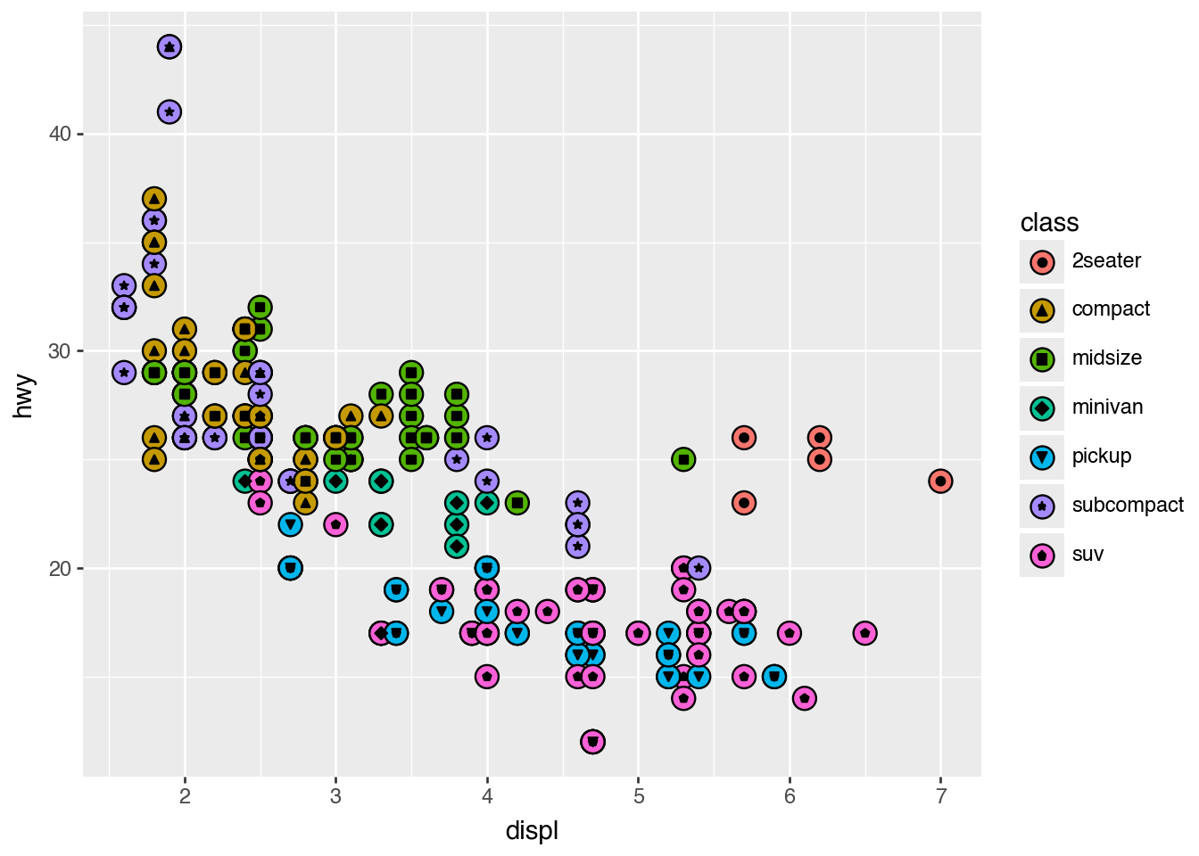
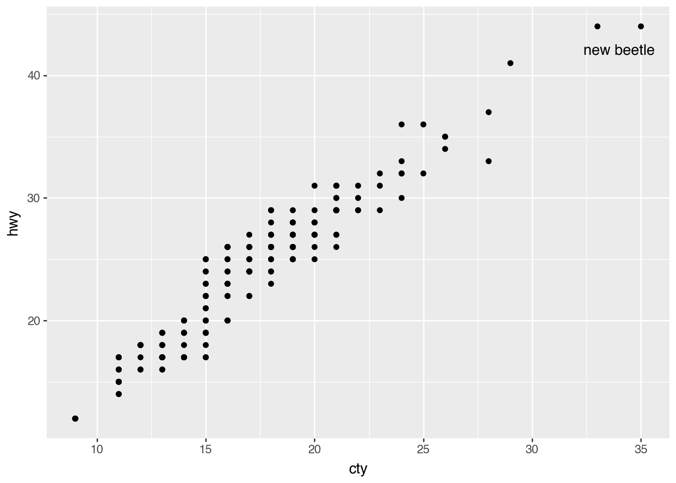
Individual Geoms
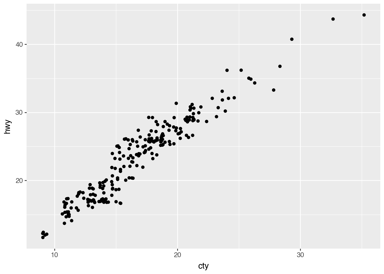
Scatterplot With Text
highest_mpg = (
    mpg
    .filter(
        pl.col("hwy") == pl.col("hwy").max(),
        pl.col("cty") == pl.col("cty").max()
    )
)

(
    ggplot(mpg)
    .aes("cty", "hwy")
    .geom_point()
    .geom_text(
        aes(label="model"),
        nudge_y=-2,
        nudge_x=-1,
        data=highest_mpg,
    )
)
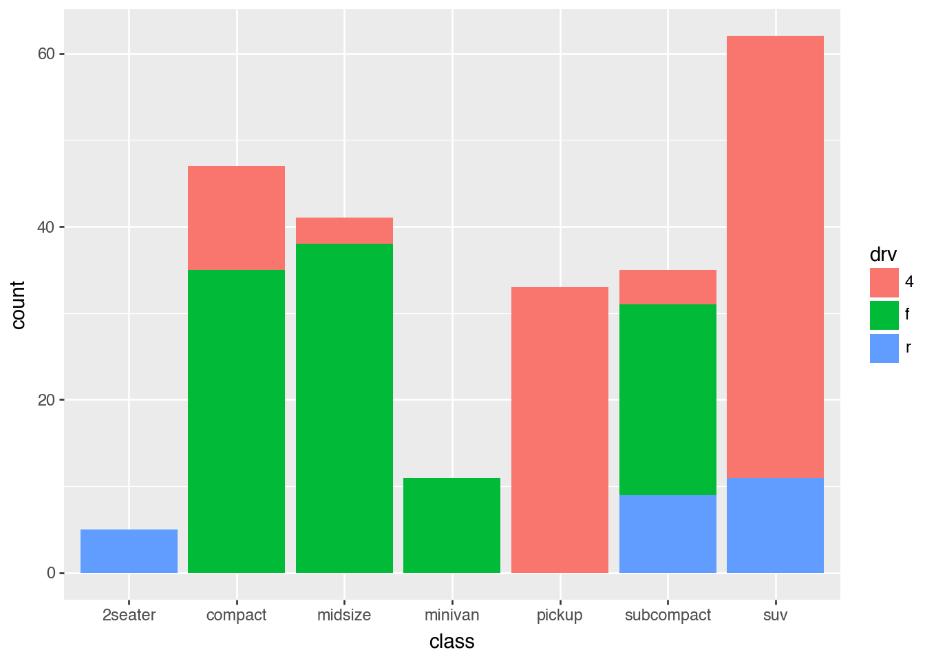
Barchart on Counts
(
    mpg
    .group_by("class", "drv").len()
    .rename({"len": "count"})
    >>
    ggplot()
    .aes("class", "count", fill="drv")
    .geom_col()
)
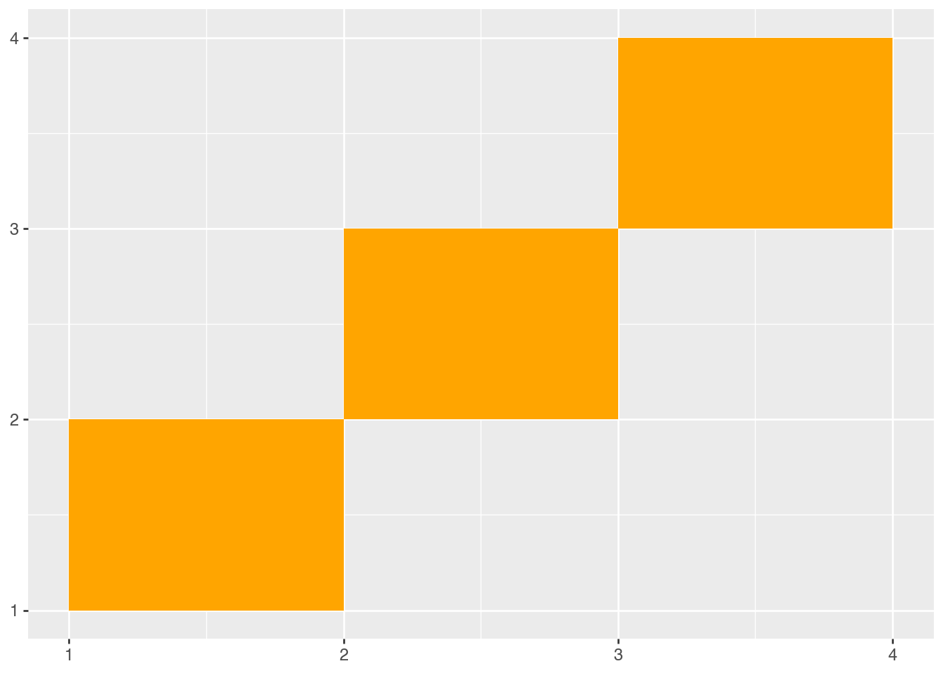
Rectangles
(
    pl.DataFrame(
        {
            "xmin": [1, 2, 3],
            "ymin": [1, 2, 3],
            "xmax": [2, 3, 4],
            "ymax": [2, 3, 4],
        }
    )
    >>
    ggplot()
    .aes(xmin="xmin", ymin="ymin", xmax="xmax", ymax="ymax")
    .geom_rect(fill="orange")
)
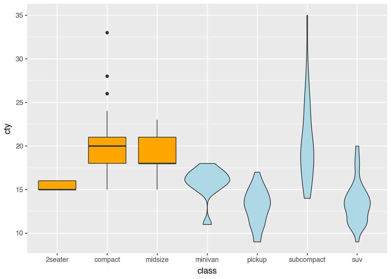
Collective Geoms for Distributions
Boxplots and Violins
selected_classes = ["2seater", "compact", "midsize"]
mpg_box = mpg.filter(pl.col("class").is_in(selected_classes))
mpg_violin = mpg.filter(~pl.col("class").is_in(selected_classes))

(
    ggplot()
    .aes("class", "cty")
    .geom_boxplot(data=mpg_box, fill="orange")
    .geom_violin(data=mpg_violin, fill="lightblue")
)
/Users/iangow/git/plotnine-fluid/.venv/lib/python3.14/site-packages/plotnine/stats/stat.py:320: UserWarning:
The following aesthetics were dropped during processing: ['y'].
plotnine could not infer the correct grouping.
Did you forget to specify a `group` aesthetic or to convert a numerical variable into a categorial?
Histograms and Densities
(
    ggplot(mpg)
    .aes("cty")
    .geom_histogram()
)
/Users/iangow/git/plotnine-fluid/.venv/lib/python3.14/site-packages/plotnine/stats/stat_bin.py:111: PlotnineWarning: 'stat_bin()' using 'bins = 17'. Pick better value with 'binwidth'.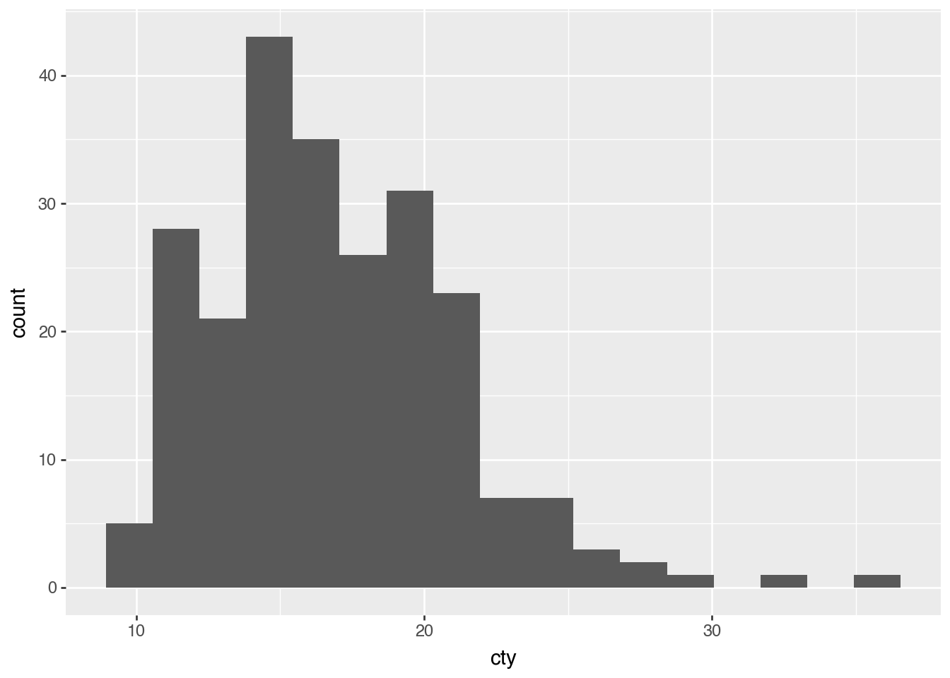
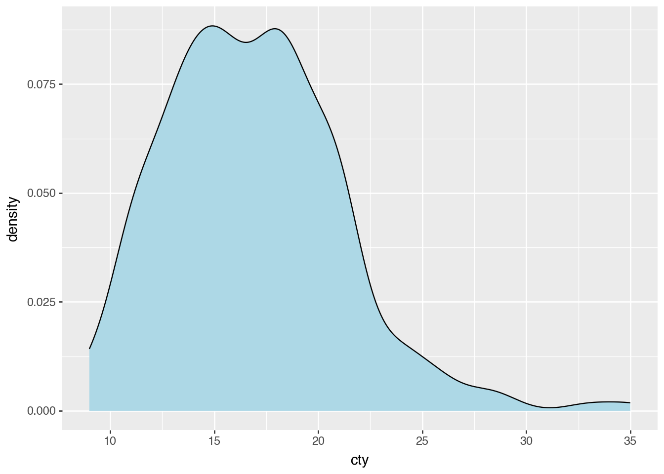
(
    ggplot(mpg)
    .aes("cty")
    .geom_density(fill="lightblue")
)
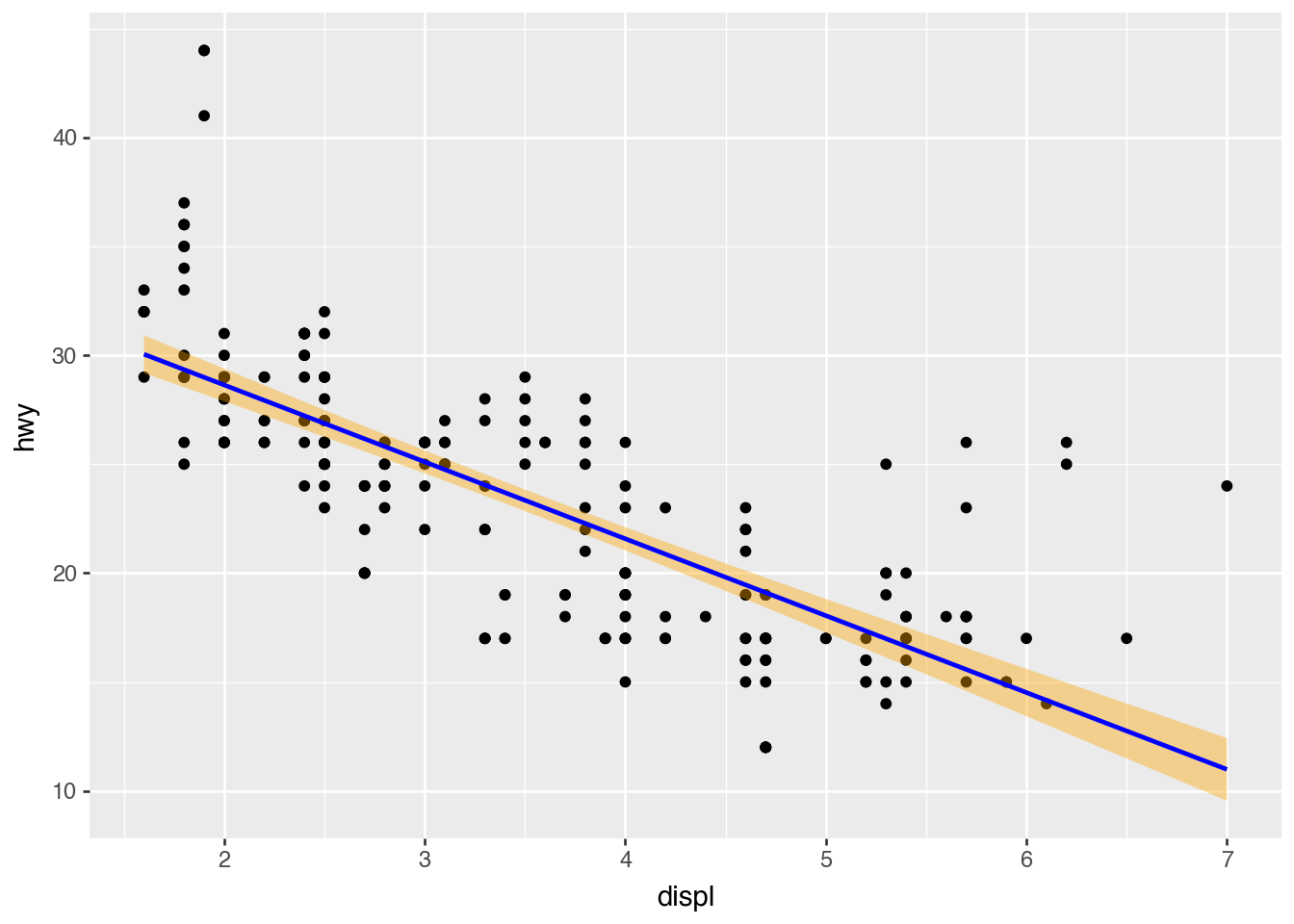
Smoothing
(
    ggplot(mpg)
    .aes("displ", "hwy")
    .geom_point()
    .geom_smooth(method="lm", color="blue", fill="orange")
)
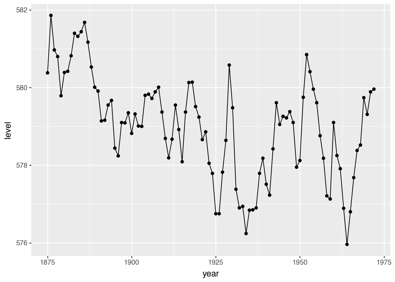
Collective Geoms for Lines and Fills
(
    ggplot(huron)
    .aes("year", "level")
    .geom_line()
    .geom_point()
)
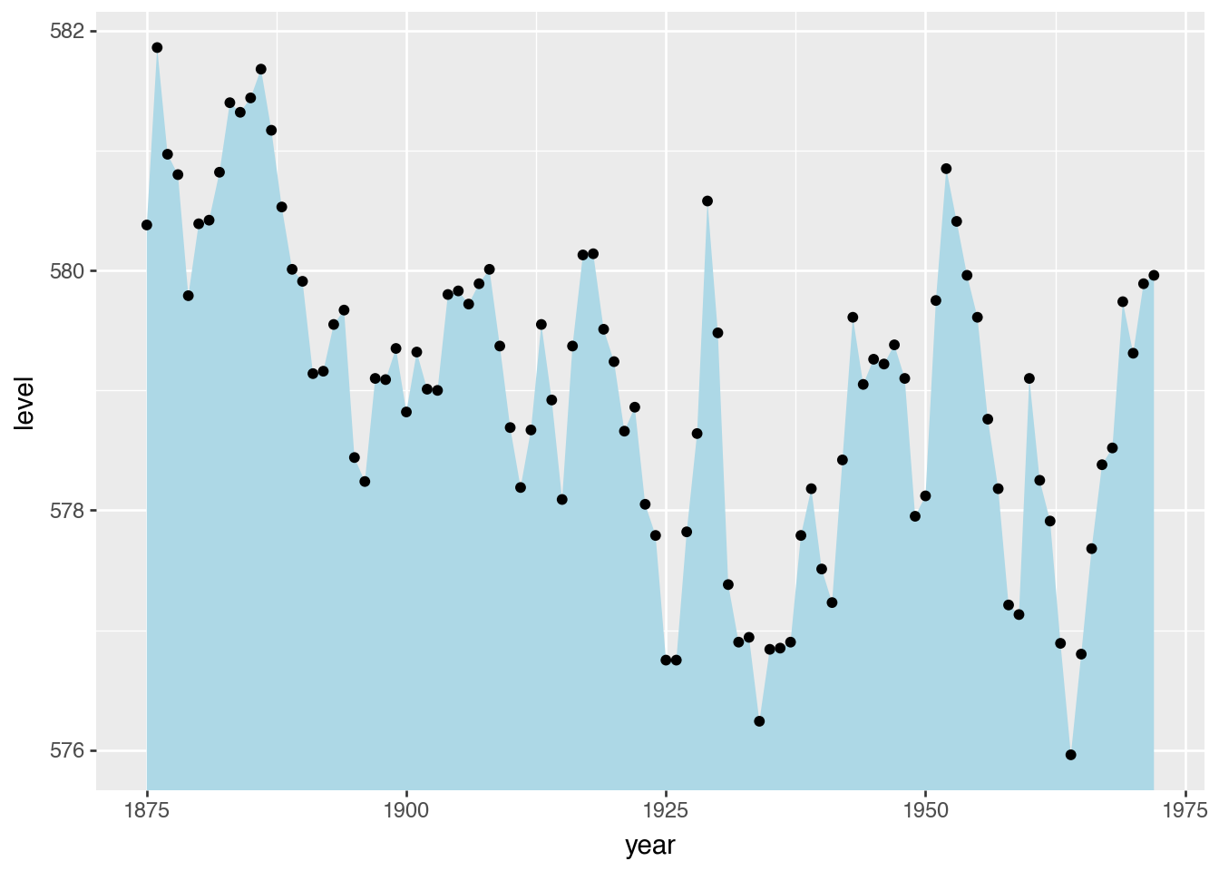
(
    ggplot(huron)
    .aes("year", "level")
    .geom_ribbon(aes(ymax="level"), ymin=0, fill="lightblue")
    .geom_point()
)
Position Adjustments
Jitter With Random Noise
(
    ggplot(mpg)
    .aes("cty", "hwy")
    .geom_point(alpha=0.2)
)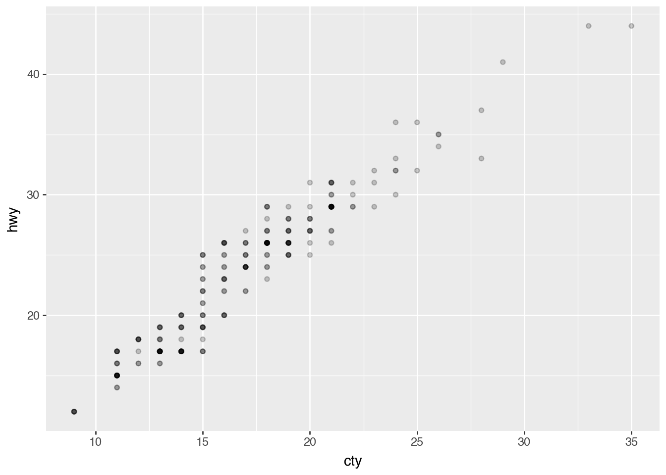
(
    ggplot(mpg)
    .aes("cty", "hwy")
    .geom_point(position=p9.position_jitter())
)
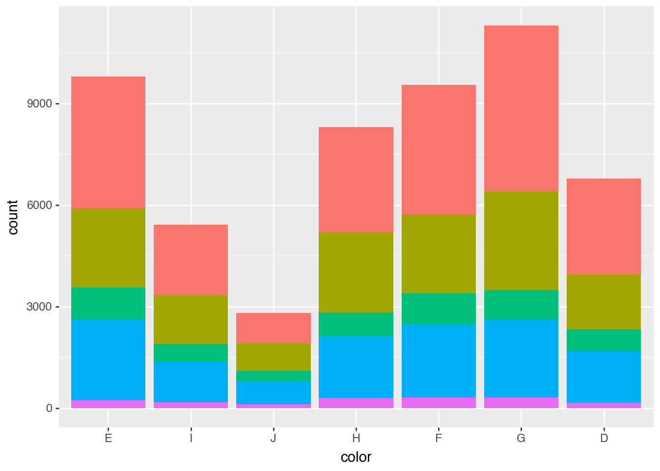
Dodge and Fill for Bars
(
    ggplot(diamonds)
    .aes("color", fill="cut")
    .add_theme(legend_position="none")
    .geom_bar()
)
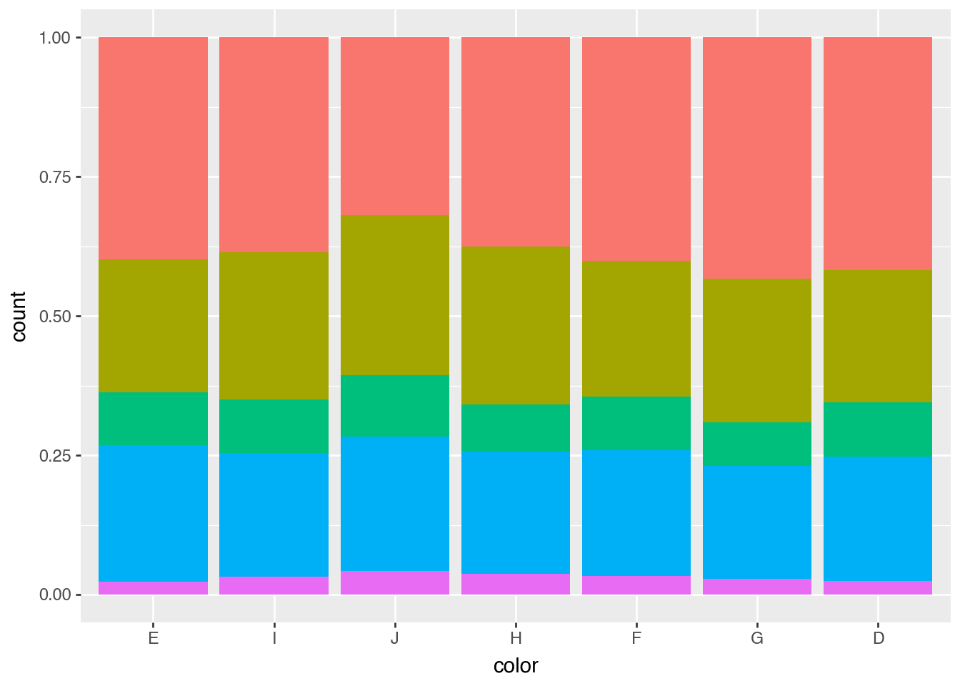
(
    ggplot(diamonds)
    .aes("color", fill="cut")
    .add_theme(legend_position="none")
    .geom_bar(position=p9.position_fill())
)
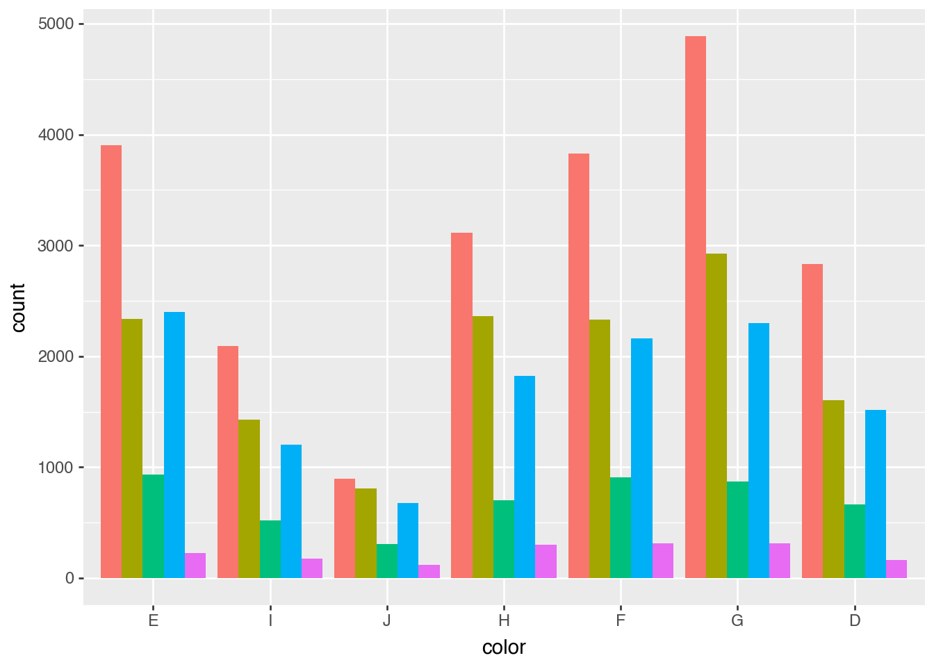
(
    ggplot(diamonds)
    .aes("color", fill="cut")
    .add_theme(legend_position="none")
    .geom_bar(position=p9.position_dodge())
)
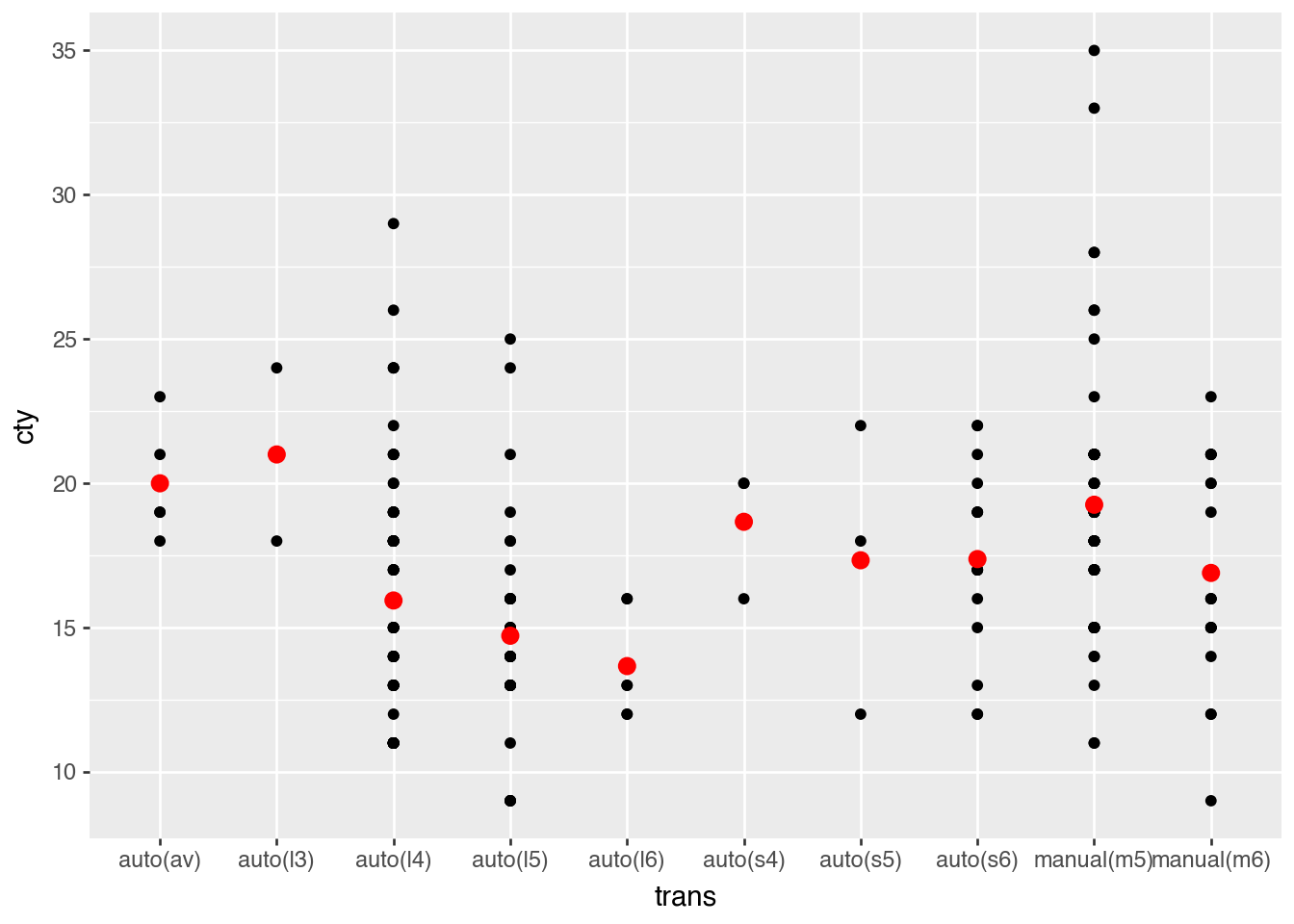
Statistical Transformations
(
    ggplot(mpg)
    .aes("trans", "cty")
    .geom_point()
    .geom_point(
        aes(group="trans"),
        color="red",
        size=3,
        stat="summary",
        fun_y=lambda x: x.mean(),
    )
)
mean_mpg = mpg.group_by("trans").agg(pl.col("cty").mean())
mean_mpg
shape: (10, 2)
| trans | cty |
|---|---|
| str | f64 |
| "manual(m6)" | 16.894737 |
| "auto(s5)" | 17.333333 |
| "auto(s6)" | 17.375 |
| "auto(av)" | 20.0 |
| "auto(l5)" | 14.717949 |
| "auto(l6)" | 13.666667 |
| "auto(l3)" | 21.0 |
| "auto(l4)" | 15.939759 |
| "manual(m5)" | 19.258621 |
| "auto(s4)" | 18.666667 |
(
    ggplot(mpg)
    .aes("trans", "cty")
    .geom_point()
    .geom_point(data=mean_mpg, color="red", size=3)
)