import polars as pl
from plotnine import ggplot, element_blank, element_line, element_rect, element_text
from plotnine.data import anscombe_quartetAnscombe’s Quartet
In 1973, Francis Anscombe introduced four small datasets with nearly identical summary statistics but very different shapes. This notebook recreates that idea with plotnine, polars, and scikit-learn.
Convert DataFrame to Polars
anscombe_quartet = pl.from_pandas(anscombe_quartet)
anscombe_quartet
shape: (44, 3)
| dataset | x | y |
|---|---|---|
| str | i64 | f64 |
| "I" | 10 | 8.04 |
| "I" | 8 | 6.95 |
| "I" | 13 | 7.58 |
| "I" | 9 | 8.81 |
| "I" | 11 | 8.33 |
| … | … | … |
| "IV" | 8 | 5.25 |
| "IV" | 19 | 12.5 |
| "IV" | 8 | 5.56 |
| "IV" | 8 | 7.91 |
| "IV" | 8 | 6.89 |
Compute Descriptive Statistics
pl.Config.set_float_precision(2)

anscombe_quartet.group_by("dataset", maintain_order=True).agg(
    pl.col("x", "y").mean().name.prefix("mean_"),
    pl.col("x", "y").var().name.prefix("variance_"),
    pl.corr("x", "y").alias("correlation_xy"),
)
shape: (4, 6)
| dataset | mean_x | mean_y | variance_x | variance_y | correlation_xy |
|---|---|---|---|---|---|
| str | f64 | f64 | f64 | f64 | f64 |
| "I" | 9.00 | 7.50 | 11.00 | 4.13 | 0.82 |
| "II" | 9.00 | 7.50 | 11.00 | 4.13 | 0.82 |
| "III" | 9.00 | 7.50 | 11.00 | 4.12 | 0.82 |
| "IV" | 9.00 | 7.50 | 11.00 | 4.12 | 0.82 |
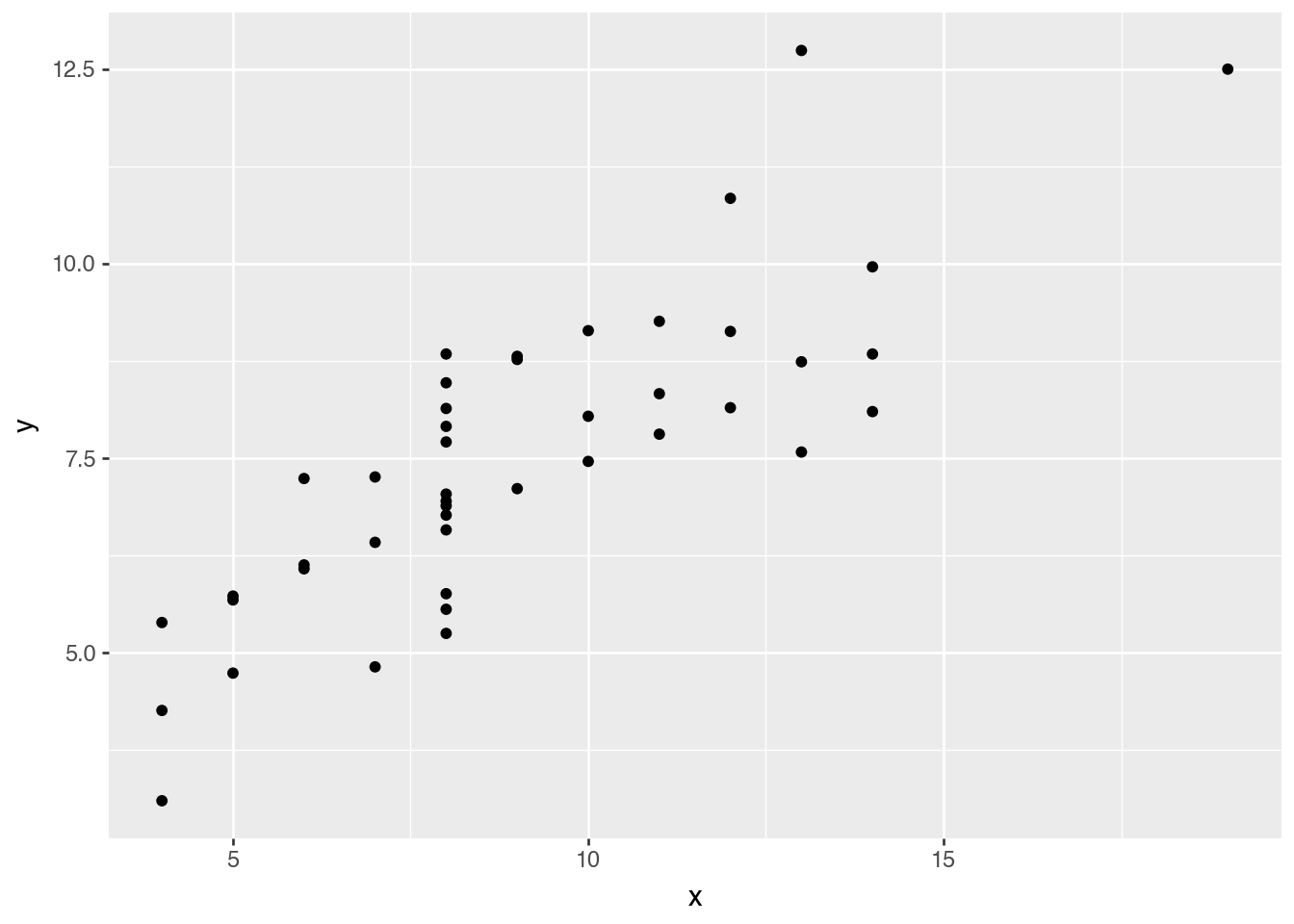
Exploratory Data Visualization
(
    ggplot(anscombe_quartet)
    .aes("x", "y")
    .geom_point()
)
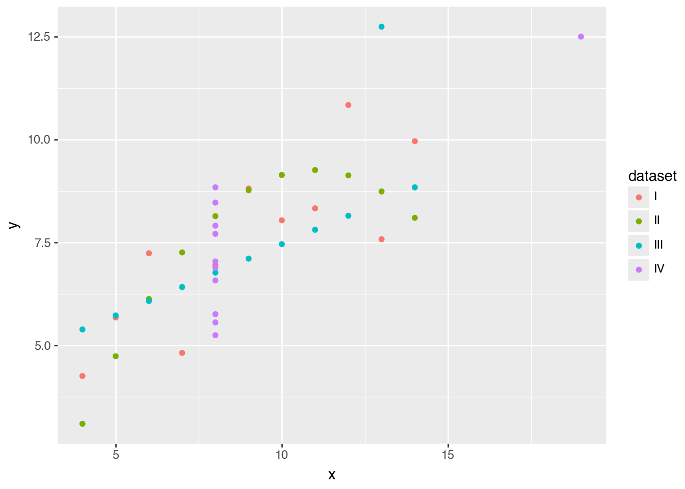
(
    ggplot(anscombe_quartet)
    .aes("x", "y", color="dataset")
    .geom_point()
)
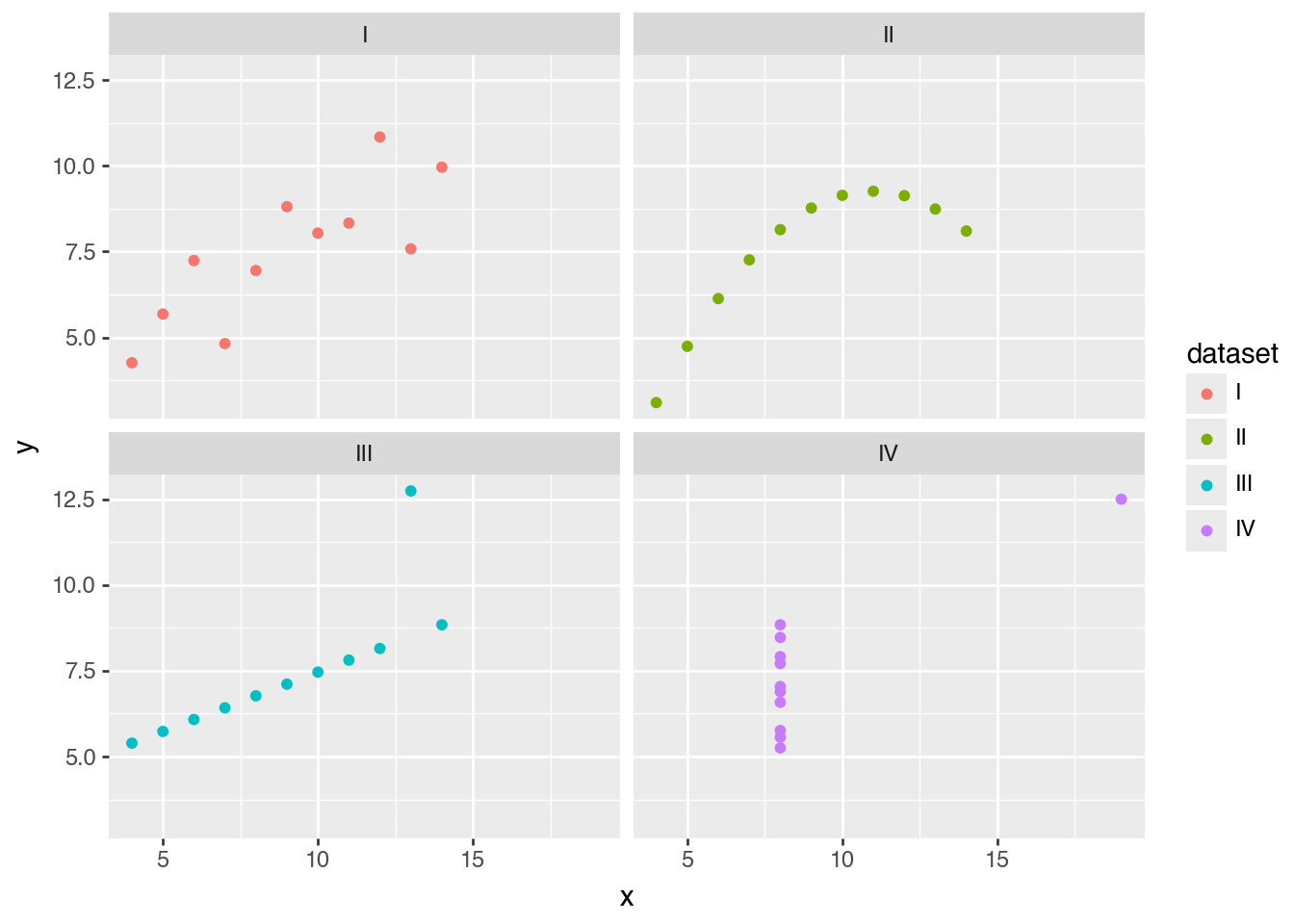
(
    ggplot(anscombe_quartet)
    .aes("x", "y", color="dataset")
    .facet_wrap("dataset")
    .geom_point()
)
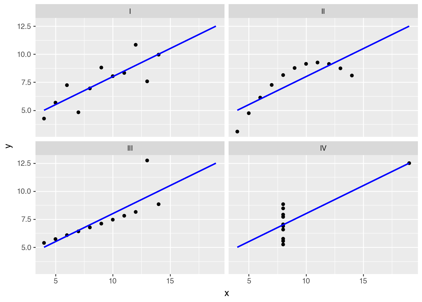
(
    ggplot(anscombe_quartet)
    .aes("x", "y")
    .geom_point()
    .geom_smooth(method="lm", se=False, fullrange=True, color="blue")
    .facet_wrap("dataset")
)
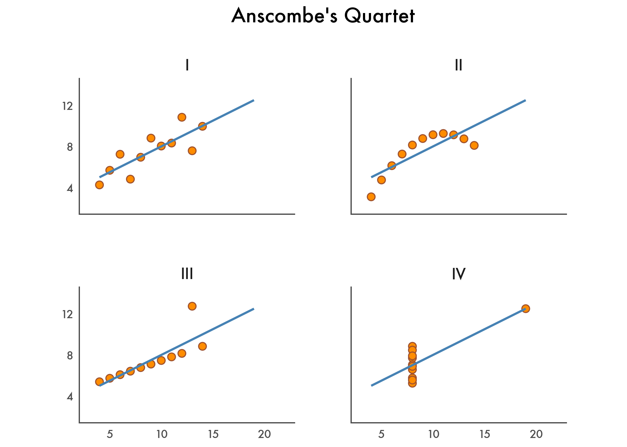
A Fine-Tuned Data Visualization
(
    ggplot(anscombe_quartet)
    .aes("x", "y")
    .geom_point(color="sienna", fill="darkorange", size=3)
    .geom_smooth(method="lm", se=False, fullrange=True, color="steelblue", size=1)
    .facet_wrap("dataset")
    .scale_y_continuous(breaks=(4, 8, 12))
    .coord_fixed(xlim=(3, 22), ylim=(2, 14))
    .labs(title="Anscombe's Quartet")
    .theme_tufte(base_family="Futura")
    .add_theme(
        axis_line=element_line(color="#4d4d4d"),
        axis_ticks_major=element_line(color="#00000000"),
        axis_title=element_blank(),
        plot_background=element_rect(fill="#ffffff", color="#ffffff"),
        dpi=144,
        panel_spacing=0.09,
        strip_text=element_text(size=12),
        title=element_text(size=16, margin={"b": 20}),
    )
)
Bonus: Apply Linear Regression
from sklearn.linear_model import LinearRegression
from sklearn.metrics import r2_score


def fit_lr(s):
    lr = LinearRegression()
    X = s.struct.field("x").to_numpy().reshape(-1, 1)
    y = s.struct.field("y").to_numpy()

    lr.fit(X, y)
    intercept = lr.intercept_
    slope = lr.coef_[0]
    r2 = r2_score(y, intercept + slope * X)

    return {"intercept": intercept, "slope": slope, "r2": r2}


(
    anscombe_quartet
    .group_by("dataset", maintain_order=True)
    .agg(
        pl.col("x", "y").mean().name.prefix("mean_"),
        pl.col("x", "y").var().name.prefix("variance_"),
        pl.corr("x", "y").alias("correlation_xy"),
        (
            pl.struct("x", "y")
            .implode()
            .map_elements(
                fit_lr,
                return_dtype=pl.Struct(
                    {"intercept": pl.Float64, "slope": pl.Float64, "r2": pl.Float64}
                ),
            )
            .alias("lr")
        ),
    )
    .unnest("lr")
)
shape: (4, 9)
| dataset | mean_x | mean_y | variance_x | variance_y | correlation_xy | intercept | slope | r2 |
|---|---|---|---|---|---|---|---|---|
| str | f64 | f64 | f64 | f64 | f64 | f64 | f64 | f64 |
| "I" | 9.00 | 7.50 | 11.00 | 4.13 | 0.82 | 3.00 | 0.50 | 0.67 |
| "II" | 9.00 | 7.50 | 11.00 | 4.13 | 0.82 | 3.00 | 0.50 | 0.67 |
| "III" | 9.00 | 7.50 | 11.00 | 4.12 | 0.82 | 3.00 | 0.50 | 0.67 |
| "IV" | 9.00 | 7.50 | 11.00 | 4.12 | 0.82 | 3.00 | 0.50 | 0.67 |