from datetime import date

import polars as pl
import plotnine_polars as p9
import socviz_pl as sv4 Example from Healy (2026)
Here I do a rough replication of a chart from Chapter 8 of Healy (2026).
Note
The examples in this chapter require a pre-release version of plotnine that includes coord_polar() and coord_radial().
Note
In this chapter, I use plotnine_polars, a package that allows me to use method chains to access most of the functionality of plotnine. I also use socviz_pl, a small package I created to give me the equivalent of Kieran Healy’s socviz R package.
4.1 FARS pedestrian data
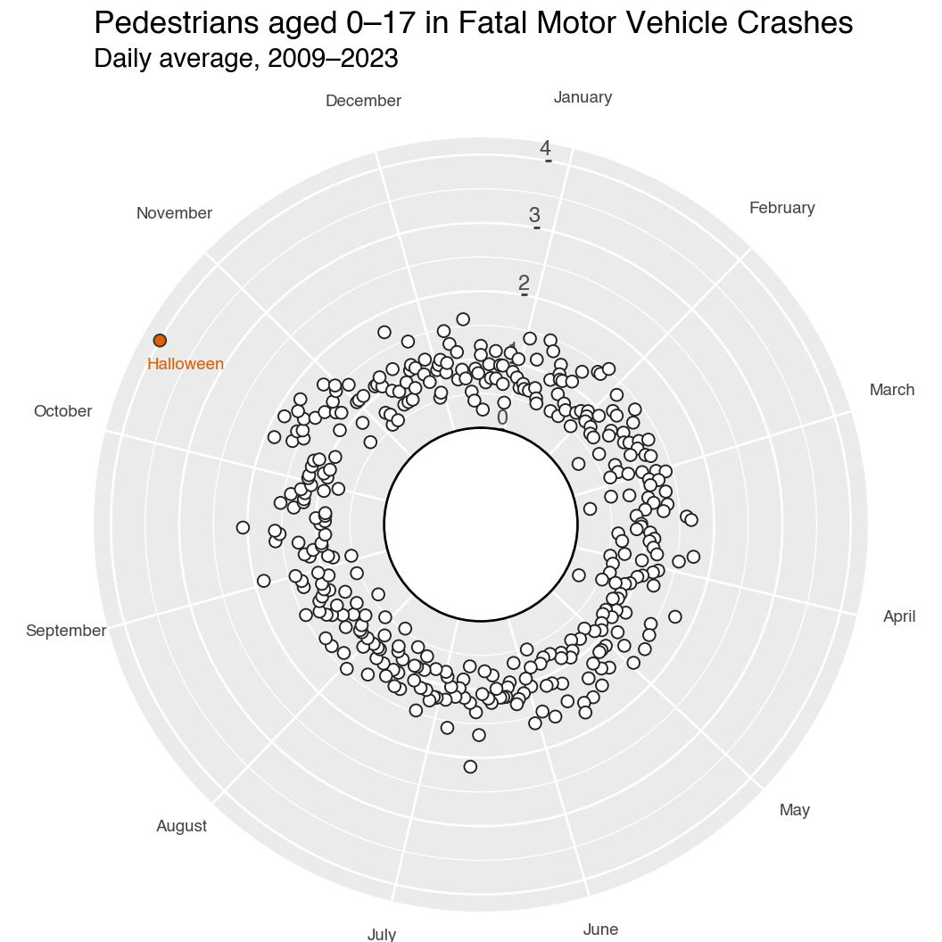
The farsinvolved dataset records daily counts of child pedestrians (aged 0–17) involved in fatal motor vehicle crashes in the United States from 2009 to 2023. We aggregate by calendar month and day, averaging across years. Year 2000 is used as a placeholder date because 2000 was a leap year.
farsinvolved = sv.load_data("farsinvolved")

month_order = [
    "January", "February", "March", "April", "May", "June",
    "July", "August", "September", "October", "November", "December",
]
month_num = {m: i + 1 for i, m in enumerate(month_order)}

fars_agg = (
    farsinvolved
    .with_columns(pl.col("day").cast(pl.Int32))
    .group_by("month", "day")
    .agg(n=pl.col("n").mean())
    .with_columns(
        month_num=pl.col("month").replace(month_num).cast(pl.Int32),
    )
    .with_columns(
        fake_yr=pl.date(2000, pl.col("month_num"), pl.col("day")),
        flag=(pl.col("month") == "October") & (pl.col("day") == 31),
    )
    .sort("fake_yr")
)
Halloween (October 31) stands out as the single most dangerous day for child pedestrians.
The chart below uses coord_radial() with inner_radius=0.25 to create a donut-shaped calendar, matching the style from Data Visualization: A Practical Introduction. The r-axis limits are fixed at (0, 4.25) so the hollow centre corresponds to zero daily average fatalities.
plot_data = (
    fars_agg
    .with_columns(
        doy=pl.col("fake_yr").dt.ordinal_day(),
        day_type=pl.when(pl.col("flag"))
                   .then(pl.lit("Halloween"))
                   .otherwise(pl.lit("Other")),
    )
)

m_breaks = [date(2000, m, 15).timetuple().tm_yday for m in range(1, 13)]
m_labels = ["January", "February", "March", "April",
            "May", "June", "July", "August", "September",
            "October", "November", "December"]

(
    plot_data
    .ggplot(p9.aes(x="doy", y="n", fill="day_type", color="day_type"))
    .geom_point(shape="o", size=2.5, stroke=0.4)
    .scale_fill_manual(values={"Halloween": "#E06000", "Other": "white"})
    .scale_color_manual(values={"Halloween": "#333333", "Other": "#222222"})
    .geom_text(data=plot_data.filter(pl.col("day_type") == "Halloween"),
               mapping=p9.aes(x="doy", y="n", label="day_type"),
               color="#E06000", size=7, nudge_x=2, nudge_y=-1,
               ha="right", inherit_aes=False)
    .scale_x_continuous(breaks=m_breaks, labels=m_labels)
    .scale_y_continuous(limits=(0, 4.25))
    .labs(
        title="Pedestrians aged 0–17 in Fatal Motor Vehicle Crashes",
        subtitle="Daily average, 2009–2023\n\n",
    )
    .coord_radial(inner_radius=0.25, expand=False)
    .add_theme(
        axis_title=p9.element_blank(),
        axis_text_x=p9.element_text(size=7, color="#444444"),
        axis_ticks_major_x=p9.element_blank(),
        legend_position="none",
        figure_size=(5.5, 5.5),
    )
)
Healy, Kieran. 2026. Data Visualization: A Practical Introduction. 2nd ed. Princeton University Press. https://socviz.co/.