import numpy as np
import polars as pl

from plotnine import (
    ggplot, aes,
    geom_bar, geom_path, geom_point,
    coord_polar,
    scale_x_discrete, scale_y_continuous,
    theme,
)

from plotnine.data import mtcars2 Examples from the ggplot2 documentation
The following examples are adapted from the ggplot2 book’s coord chapter.
Note
2.1 Bar → Pie → Bullseye (mtcars)
A stacked bar chart becomes a pie chart when theta = "y" maps height (count) to angle, and a bullseye chart when the default theta = "x" maps the discrete x position to angle instead.
mtcars_pl = (
    pl.from_pandas(mtcars)
    .with_columns(
        pl.lit("1").alias("x"),
        pl.col("cyl").cast(pl.Utf8),
    )
)
The code below shows how we can turn a bar into a pie chart or a bullseye chart by changing the coordinate system.
base = (
    ggplot(mtcars_pl, aes(x="x", fill="cyl"))
    + geom_bar(width=1)
    + scale_x_discrete(expand=(0, 0))
    + scale_y_continuous(expand=(0, 0))
    + theme(legend_position="none", figure_size=(4, 4))
)

base.show()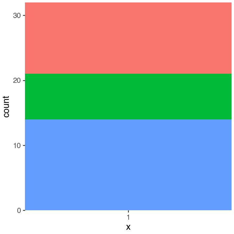
In the original, the following plot has the \(y\)-axis labels from Figure 2.1 as labels around the circle.
base + coord_polar(theta="y")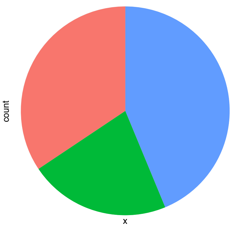
Unlike the ggplot2 original, Figure 2.2 is missing count labels around the circumference. The reason is that coord_polar.setup_panel_params explicitly suppresses the theta-axis breaks before handing the panel view to Matplotlib:
new_x = replace(pv_exp.x, ..., breaks=[], labels=[])When theta = "y" the \(y\)-scale breaks (e.g. \(0, 5, 10, \dots\)) are the values that should appear at their corresponding angles around the circle, but they are discarded here before rendering begins.
Because the underlying axes object is already a Matplotlib PolarAxes — the facet creates it with projection='polar' whenever coord_polar is in use — the angular label machinery already exists.
PolarAxes.set_thetagrids(angles_in_degrees, labels) places labelled tick marks at arbitrary angles around the circumference, which is exactly what is needed.
A targeted fix in coord_polar.py would:
- Stash the theta-axis breaks (in data units) inside
self.paramsduringsetup_panel_params, before zeroing them out. - In
draw(), convert those saved breaks to degrees via_to_radians(then multiply by \(180/\pi\)) and callpolar_ax.set_thetagrids(degrees, labels).
No geometry or data-transformation code would need to change; the fix is entirely within the axis-decoration layer.
In the original, the following plot has the \(y\)-axis labels from Figure 2.1 as labels along the vertical axis.
base + coord_polar()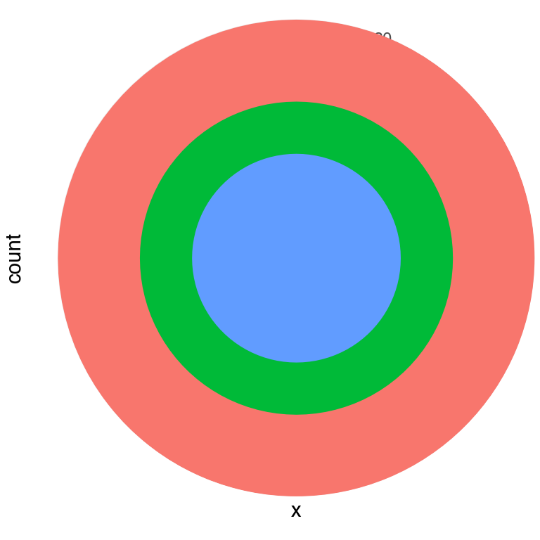
2.2 Polar path (spiral)
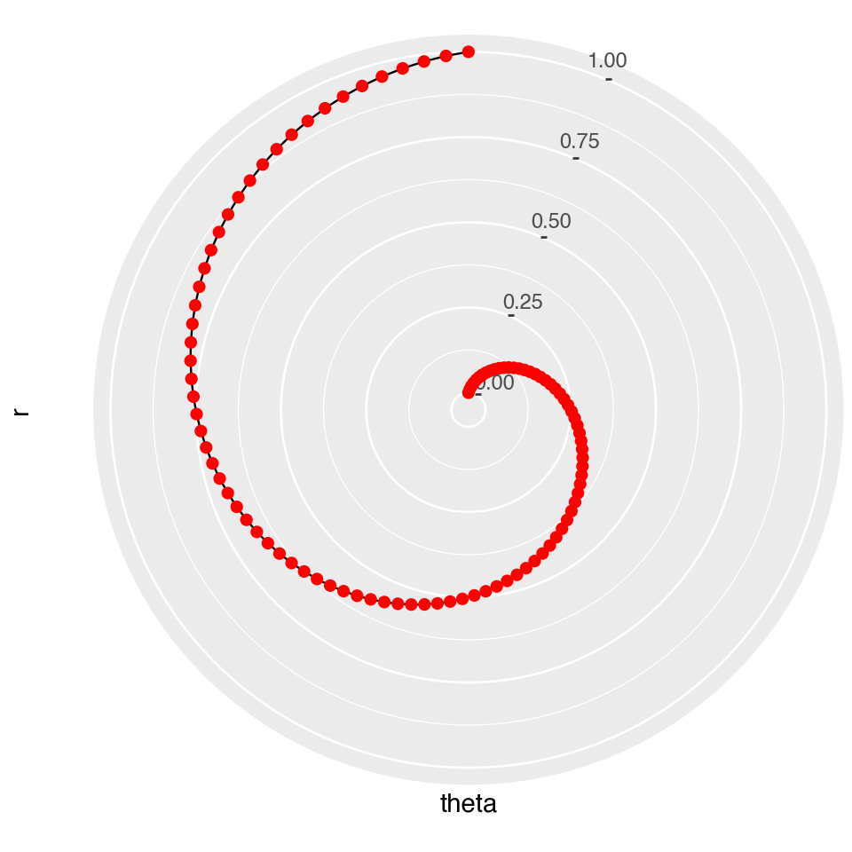
In ggplot2 a straight line in Cartesian space becomes a spiral in polar coordinates. theta = "x" maps the x-column (here: angle in radians) to the angular axis; y maps to radius.
n = 100
spiral = pl.DataFrame({
    "r":     np.linspace(0, 1, n),
    "theta": np.linspace(0, 3 / 2 * np.pi, n),
})

(
    ggplot(spiral, aes(x="theta", y="r"))
    + geom_path()
    + geom_point(size=2, color="red")
    + coord_polar()
    + theme(figure_size=(5, 5))
)