from datetime import date

import polars as pl
import plotnine_polars as p9
import socviz_pl as sv
from plotnine_polars import aes5 Climate circles
This chapter adapts Dominic Royé’s climate circles example to plotnine_polars. The data are daily station temperatures for nine US cities, averaged by day of year over 1991-2020. Each line shows the average daily temperature range, while colour marks the daily mean temperature.
Caution
All of the examples on this page require the coord-polar branch of iangow/plotnine. The standard version of plotnine does not include the coord_polar() and coord_radial() functions used here.
Note
In this chapter, I use plotnine_polars, a package that allows me to use method chains to access most of the functionality of plotnine. I also use socviz_pl, a small package I created to give me the equivalent of Kieran Healy’s socviz R package. (In this chapter, socviz_pl is simply the convenient place I stuck the meteo_yday I use below.)
meteo_yday = sv.load_data("meteo_yday")

month_breaks = [date(2000, m, 15).timetuple().tm_yday
                for m in range(1, 13)]
month_labels = ["Jan", "Feb", "Mar", "Apr", "May", "Jun",
                "Jul", "Aug", "Sep", "Oct", "Nov", "Dec"]

month_grid = pl.DataFrame({
    "x": [date(2000, m, 1).timetuple().tm_yday
          for m in range(1, 13)],
    "y": [-10] * 12,
    "xend": [date(2000, m, 1).timetuple().tm_yday
             for m in range(1, 13)],
    "yend": [41] * 12,
})

temp_grid = pl.DataFrame({"y": [-10, 0, 10, 20, 30, 40]})
temp_labels = pl.DataFrame({
    "x": [366] * 6,
    "y": [-10, 0, 10, 20, 30, 40],
    "label": ["-10", "0", "10", "20", "30", "40"],
})

def _radial_angle_day(day, x_min=1, x_max=366, start_deg=0):
    frac = (day - x_min) / (x_max - x_min)
    return -(start_deg + frac * 360) % 360

label_r = 42
month_label_df = pl.DataFrame({
    "x": month_breaks,
    "y": [label_r] * 12,
    "label": month_labels,
    "angle": [_radial_angle_day(d) for d in month_breaks],
})
5.1 One City
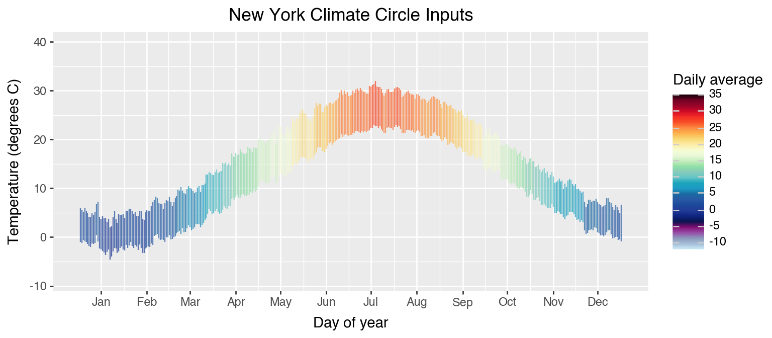
The non-polar version is a useful way to read the geometry. The x-axis is day of year, and each vertical line runs from the daily average minimum to the daily average maximum.
ny_city = meteo_yday.filter(pl.col("name") == "NEW YORK")

(
    ny_city
    .ggplot(aes(x="yd", ymin="tmin", ymax="tmx", color="ta"))
    .geom_linerange(size=0.5, alpha=0.7)
    .scale_y_continuous(breaks=range(-30, 51, 10), limits=(-11, 42),
                        expand=(0, 0))
    .scale_color_cmap(cmap_name="Spectral_r", limits=(-12, 35),
                      breaks=range(-10, 36, 5))
    .scale_x_continuous(breaks=month_breaks, labels=month_labels)
    .labs(
        title="New York Climate Circle Inputs",
        x="Day of year",
        y="Temperature (degrees C)",
        color="Daily average",
    )
    .add_theme(figure_size=(8, 3.5))
)
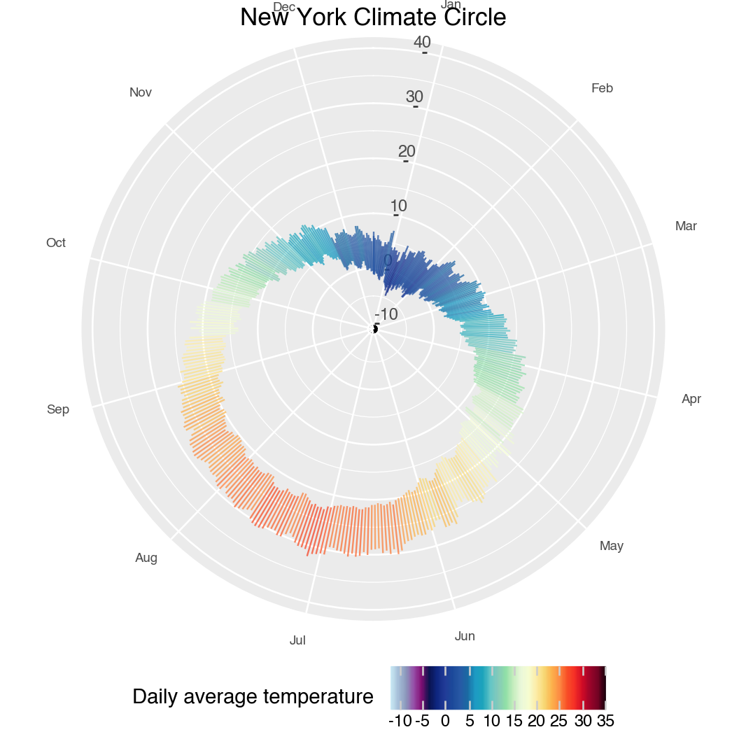
Adding coord_radial() wraps the same daily ranges around the year. The month labels are theta-axis labels, while the temperature axis is drawn inside the circle.
(
    ny_city
    .ggplot(aes(x="yd", ymin="tmin", ymax="tmx", color="ta"))
    .geom_linerange(size=0.5, alpha=0.75)
    .geom_text(data=month_label_df,
               mapping=aes(x="x", y="y", label="label", angle="angle"),
               size=7, ha="center", va="center", inherit_aes=False)
    .scale_y_continuous(breaks=range(-30, 51, 10), limits=(-11, label_r + 3),
                        expand=(0, 0))
    .scale_color_cmap(cmap_name="Spectral_r", limits=(-12, 35),
                      breaks=range(-10, 36, 5))
    .scale_x_continuous(breaks=month_breaks, labels=month_labels)
    .coord_radial(r_axis_inside=True, expand=False)
    .labs(
        title="New York Climate Circle",
        color="Daily average temperature",
    )
    .add_theme(
        axis_title=p9.element_blank(),
        axis_text_x=p9.element_blank(),
        legend_position="bottom",
        figure_size=(5.5, 5.5),
    )
)
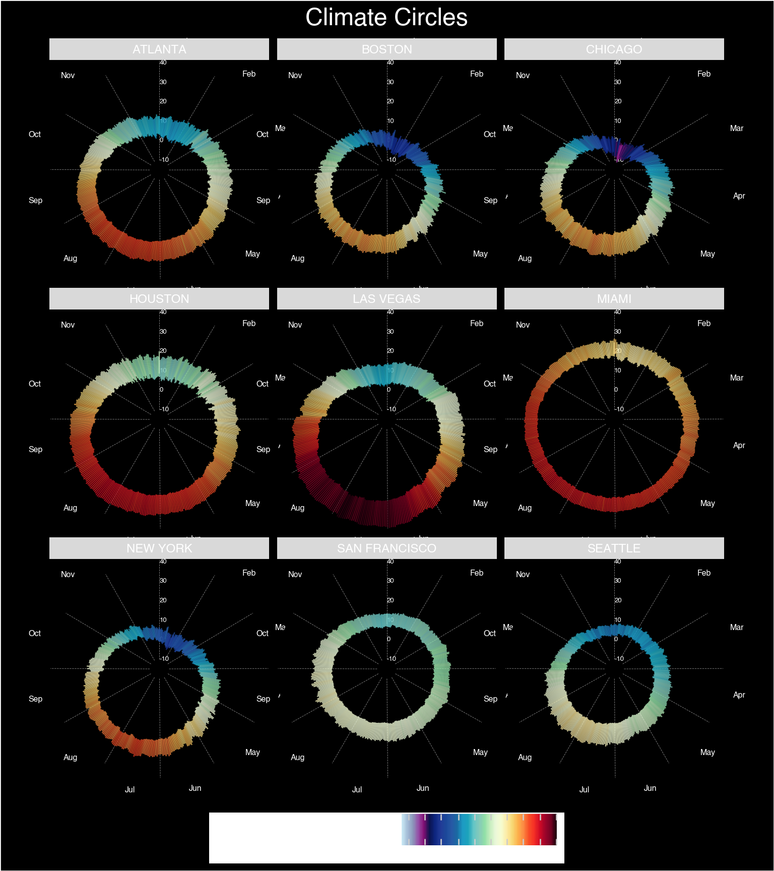
5.2 Nine Cities
The faceted version adds reference rings and month spokes before drawing the daily ranges. This follows the structure of Royé’s final chart, translated to plotnine_polars and the current coord_radial() argument names.
(
    meteo_yday
    .ggplot(aes(x="yd", ymin="tmin", ymax="tmx", color="ta"))
    .geom_text(data=temp_labels,
               mapping=aes(x="x", y="y", label="label"),
               color="white", size=5, ha="left", inherit_aes=False)
    .geom_segment(data=month_grid,
                  mapping=aes(x="x", y="y", xend="xend", yend="yend"),
                  color="white", size=0.2, linetype="dashed",
                  alpha=0.5, inherit_aes=False)
    .geom_linerange(size=0.5, alpha=0.75)
    .geom_text(data=month_label_df,
               mapping=aes(x="x", y="y", label="label", angle="angle"),
               color="white", size=5, ha="center", va="center",
               inherit_aes=False)
    .scale_y_continuous(breaks=range(-30, 41, 10),
                        limits=(meteo_yday["tmin"].min(), label_r),
                        expand=(0, 0))
    .scale_color_cmap(cmap_name="Spectral_r",
                      limits=(meteo_yday["ta"].min(),
                              meteo_yday["ta"].max()),
                      breaks=range(-10, 36, 5))
    .scale_x_continuous(breaks=month_breaks, labels=month_labels)
    .facet_wrap("name", nrow=3)
    .coord_radial(r_axis_inside=True, expand=False)
    .labs(
        title="Climate Circles",
        color="Daily average temperature",
    )
    .add_theme(
        plot_background=p9.element_rect(fill="#2b2b2b"),
        panel_background=p9.element_rect(fill="#2b2b2b"),
        panel_grid_major_x=p9.element_blank(),
        panel_grid_major_y=p9.element_line(color="white", size=0.35),
        axis_title=p9.element_blank(),
        axis_text_x=p9.element_blank(),
        axis_text_y=p9.element_blank(),
        axis_ticks=p9.element_blank(),
        legend_position="bottom",
        legend_title=p9.element_text(color="white"),
        legend_text=p9.element_text(color="white"),
        legend_background=p9.element_rect(fill="#2b2b2b"),
        plot_title=p9.element_text(color="white", ha="center", size=18),
        strip_background=p9.element_rect(fill="#2b2b2b"),
        strip_text=p9.element_text(color="white", weight="bold", size=9),
        figure_size=(10, 11),
    )
)