import polars as pl
import plotnine_polars as p9
from plotnine_polars import ggplot, aes
from socviz_pl import theme_socviz

p9.theme_set(theme_socviz())

gapminder = pl.read_csv(
    "https://raw.githubusercontent.com/jennybc/gapminder/main/inst/extdata/gapminder.tsv",
    separator="\t"
)3 Make a Plot
3.1 How ggplot Works
Perhaps this section should be how plotnine works, but ggplot() (or .ggplot() still applies, so I keep the original section title from Healy (2026). Everything from the original section applies here.
3.2 Tidy Data
While the term tidy data comes from Wickham (2014) and is therefore perhaps more often associated with R, it describes ideas that predate Wickham (2014) and applies equally well to Python Polars.
3.3 Mappings Link Data to Things You See
Here I follow Healy (2026) in using the gapminder data set. While Healy (2026) accesses this data set using library(gapminder), I get it from the GitHub page for that R package.
From the following code, we see that we have the same data as are shown in Healy (2026).
gapminder.head(10)
shape: (10, 6)
| country | continent | year | lifeExp | pop | gdpPercap |
|---|---|---|---|---|---|
| str | str | i64 | f64 | i64 | f64 |
| "Afghanistan" | "Asia" | 1952 | 28.801 | 8425333 | 779.445314 |
| "Afghanistan" | "Asia" | 1957 | 30.332 | 9240934 | 820.85303 |
| "Afghanistan" | "Asia" | 1962 | 31.997 | 10267083 | 853.10071 |
| "Afghanistan" | "Asia" | 1967 | 34.02 | 11537966 | 836.197138 |
| "Afghanistan" | "Asia" | 1972 | 36.088 | 13079460 | 739.981106 |
| "Afghanistan" | "Asia" | 1977 | 38.438 | 14880372 | 786.11336 |
| "Afghanistan" | "Asia" | 1982 | 39.854 | 12881816 | 978.011439 |
| "Afghanistan" | "Asia" | 1987 | 40.822 | 13867957 | 852.395945 |
| "Afghanistan" | "Asia" | 1992 | 41.674 | 16317921 | 649.341395 |
| "Afghanistan" | "Asia" | 1997 | 41.763 | 22227415 | 635.341351 |
We imported ggplot() above as a function. If we follow the R approach and access this function directly, we need to tell the function what data we want to use.
p = ggplot(data=gapminder)However, an alternative approach uses the fact that plotnine_polars added a .ggplot() method where it is clear what data set we want to use.
p = gapminder.ggplot()Healy (2026) says: “At this point ggplot knows our data, but not … the mapping. That is, we need to tell it which variables in the data should be represented by which visual elements in the plot. … In ggplot, mappings are specified using the aes() function.” We can use the same approach with plotnine because we have imported aes().
p = (
    gapminder
    .ggplot(aes(x="gdpPercap", y="lifeExp"))
)
As an alternative, we can use the .aes() method created by plotnine_polars as follows.
p = (
    gapminder
    .ggplot(aes(x="gdpPercap", y="lifeExp"))
)
As in Healy (2026), if we type p as the console, we get the result seen below.
p
As discussed by Healy (2026), the issue is that “We haven’t yet given p any instructions about what sort of plot to draw with the information it has. We need to add a layer to the plot. This means picking a geom_ function. We will use geom_point(). It knows how to take x and y values and plot them in a scatterplot.”
With plotnine_polars it is more natural to use the .geom_point() method instead of importing and using the geom_point() function. The result from doing so is seen in Figure 3.1.
p.geom_point()
(
gapminder
.ggplot(aes(x="gdpPercap",y="lifeExp"))
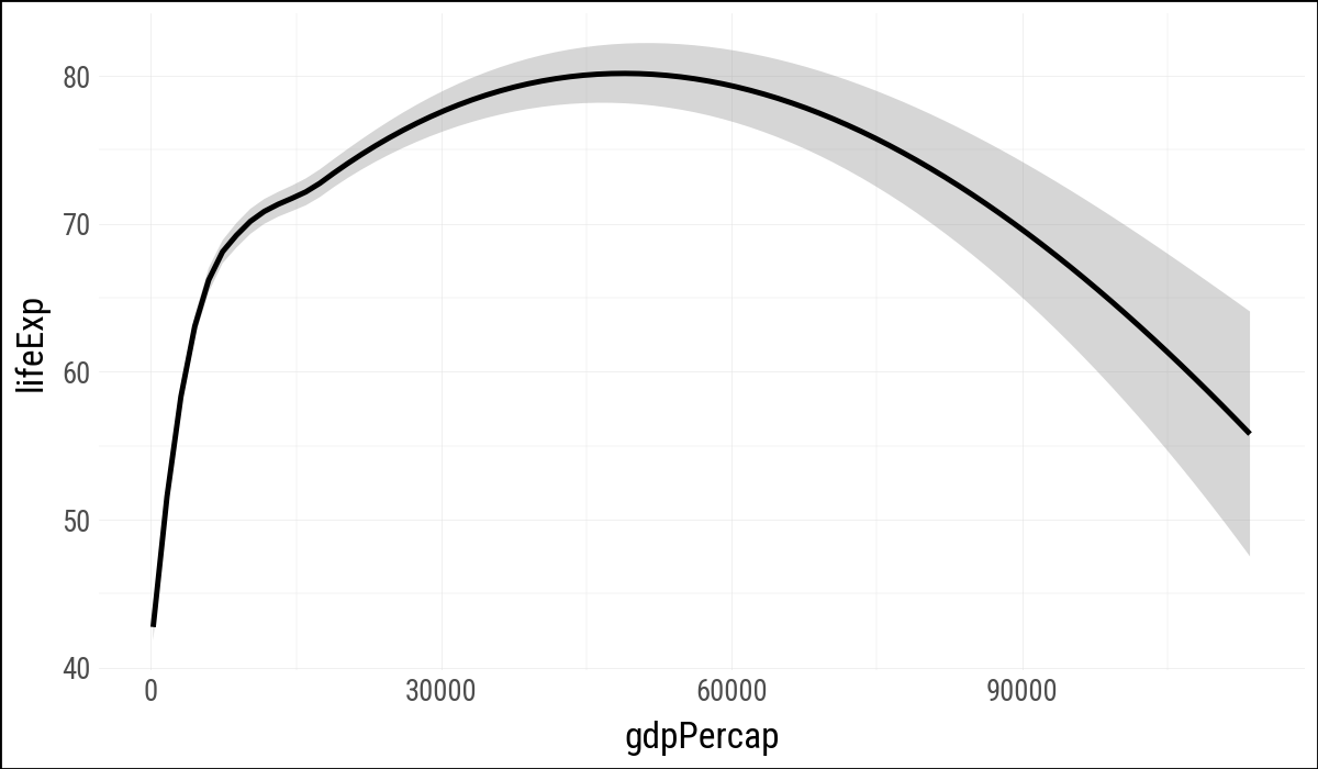
.geom_smooth(method="loess")
)
p = gapminder.ggplot(aes(x="gdpPercap", y="lifeExp"))

p.geom_point().geom_smooth(method="loess")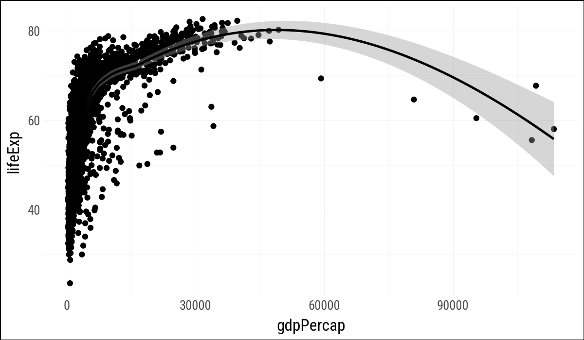
p = gapminder.ggplot(aes(x="gdpPercap", y="lifeExp"))

p.geom_point().geom_smooth(method="lm")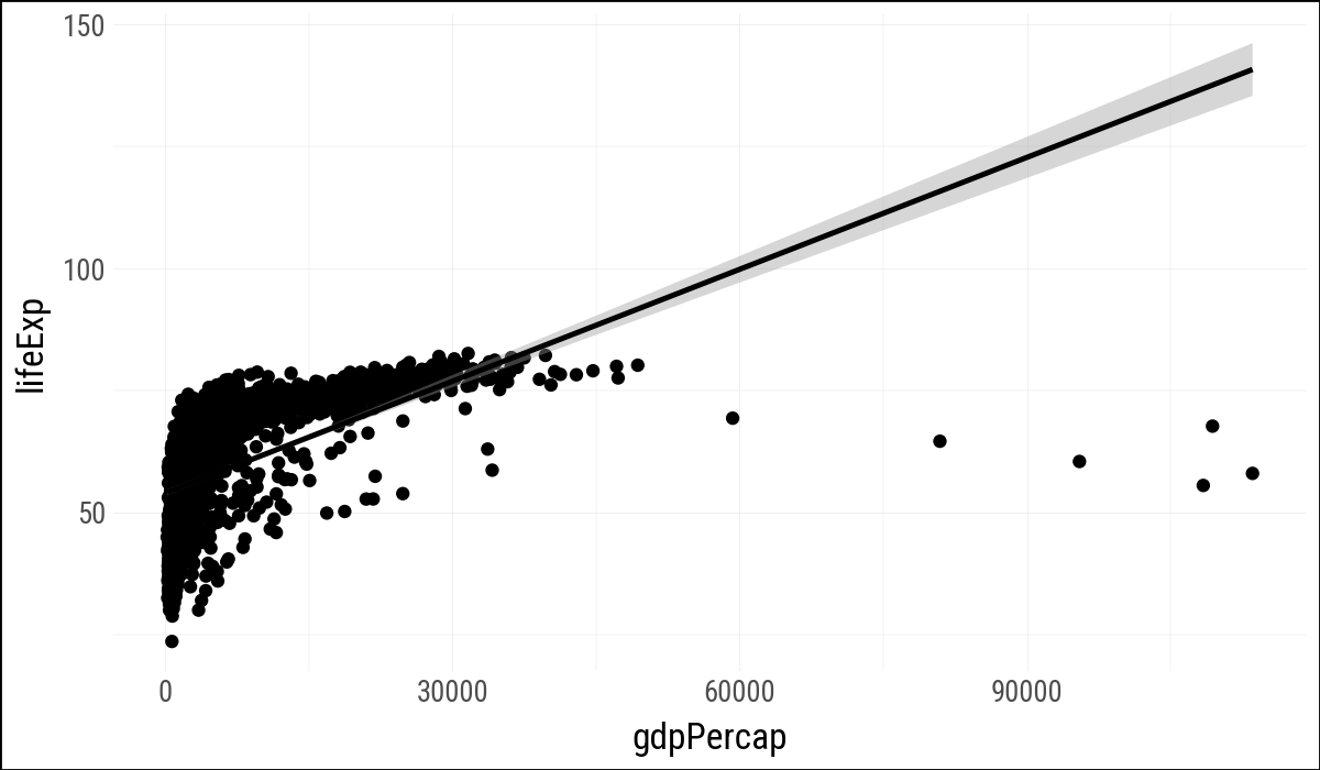
p = gapminder.ggplot(aes(x="gdpPercap", y="lifeExp"))
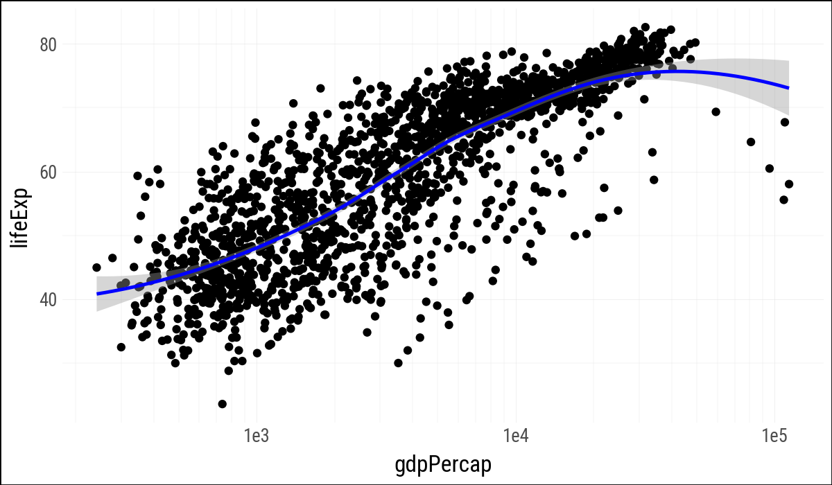
(
p
.geom_point()
.geom_smooth(method="loess", color="blue")
.scale_x_log10()
)
Now skip creating p.
(
    gapminder
    .ggplot(aes(x="gdpPercap", y="lifeExp"))
    .geom_point()
    .geom_smooth(method="loess", color="blue")
    .scale_x_log10()
)
(
    gapminder
    .ggplot(aes(x="gdpPercap", y="lifeExp"))
    .geom_point()
    .geom_smooth(method="loess", colour="blue")
    .scale_x_log10()
)
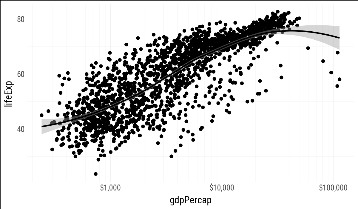
from mizani.formatters import currency_format

p = gapminder.ggplot(aes(x="gdpPercap", y="lifeExp"))

(
    p
    .geom_point()
    .geom_smooth(method="loess")
    .scale_x_log10(labels=currency_format(precision=0, big_mark=','))
)
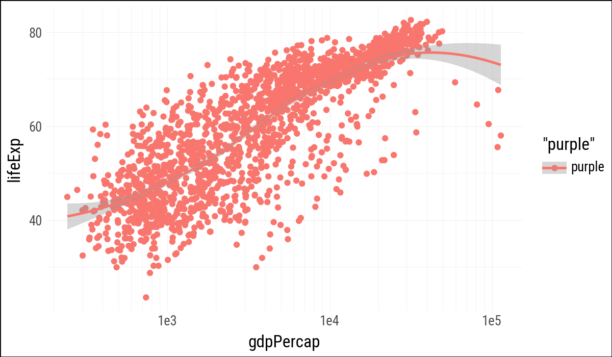
(
    gapminder
    .ggplot(aes(x="gdpPercap", y="lifeExp", color='"purple"'))
    .geom_point()
    .geom_smooth(method="loess")
    .scale_x_log10()
)
(
gapminder
.ggplot(aes(x="gdpPercap", y="lifeExp"))
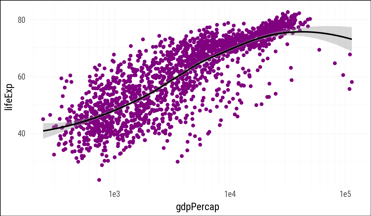
.geom_point(color="purple")
.geom_smooth(method="loess")
.scale_x_log10()
)
(
gapminder
.ggplot(aes(x="gdpPercap", y="lifeExp"))
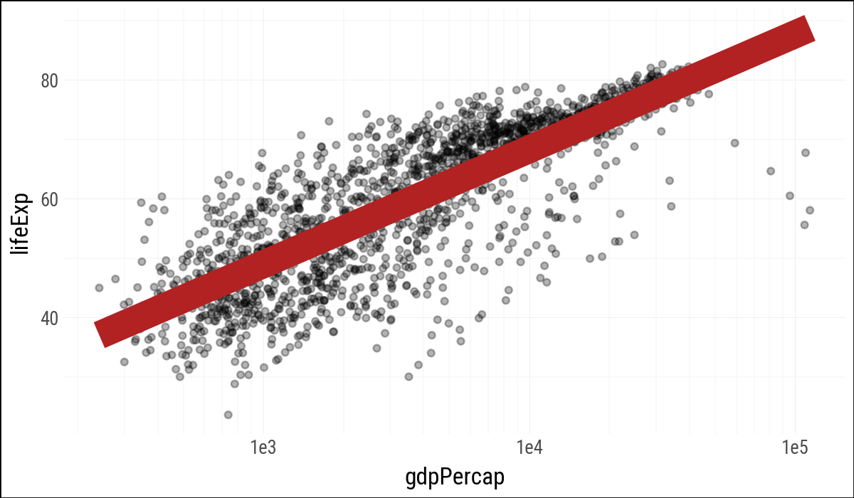
.geom_point(alpha=0.3)
.geom_smooth(color="firebrick", se=False,
size=8, # not linewidth
method="lm")
.scale_x_log10()
)
(
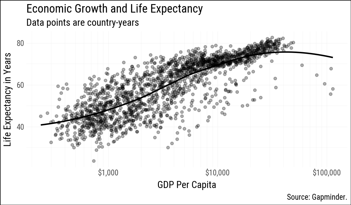
gapminder
.ggplot(aes(x="gdpPercap", y="lifeExp"))
.geom_point(alpha=0.3)
.geom_smooth(method="loess", se=False)
.scale_x_log10(labels=currency_format(precision=0, big_mark=','))
.labs(x="GDP Per Capita", y="Life Expectancy in Years",
title="Economic Growth and Life Expectancy",
subtitle="Data points are country-years",
caption="Source: Gapminder.")
)
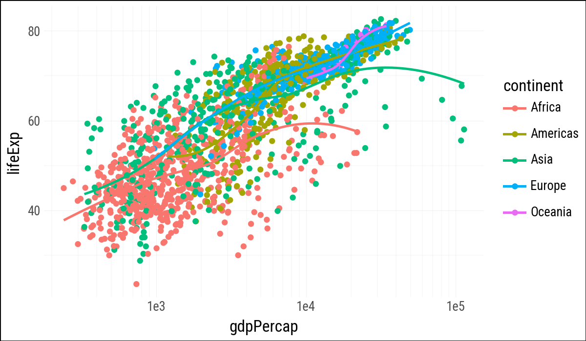
(
    gapminder
    .ggplot()
    .aes(x="gdpPercap", y="lifeExp", color="continent")
    .geom_point()
    .geom_smooth(method="loess", se=False)
    .scale_x_log10()
)
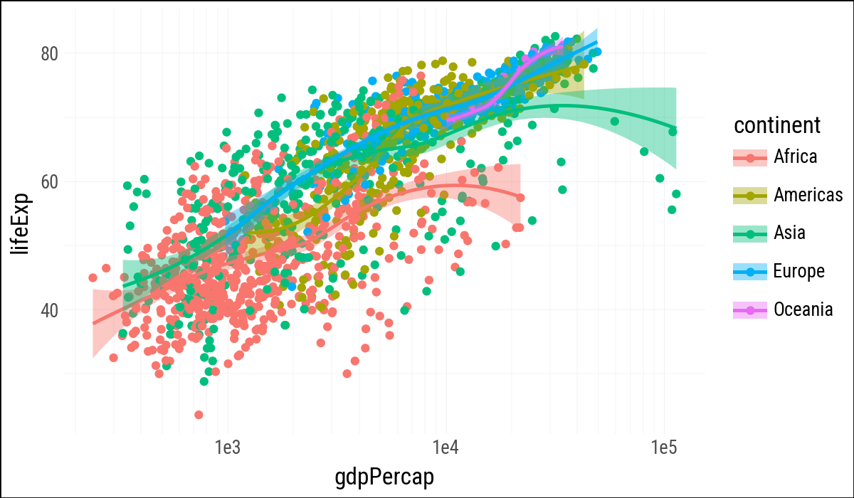
(
    gapminder
    .ggplot(aes(x="gdpPercap", y="lifeExp",
                color="continent", fill="continent"))
    .geom_point()
    .geom_smooth(method="loess")
    .scale_x_log10()
)
from plotnine_polars import aes

(
    gapminder
    .ggplot(aes(x="gdpPercap", y="lifeExp"))
    .geom_point(aes(color="continent"))
    .geom_smooth(method="loess")
    .scale_x_log10()
)
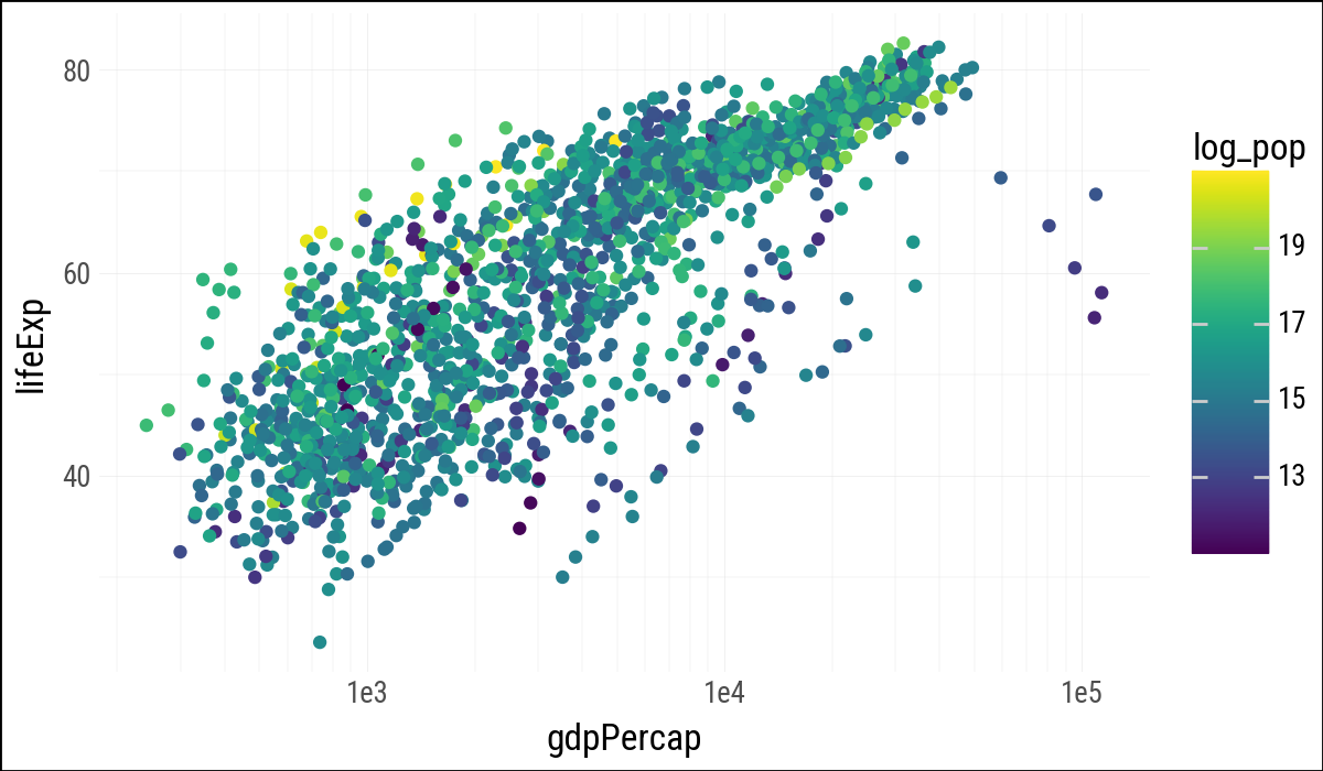
import numpy as np(
gapminder
.with_columns(log_pop=pl.col("pop").log())
.ggplot(aes(x="gdpPercap", y="lifeExp", color="log_pop"))
.geom_point()
.scale_x_log10()
)
p_out = (
    gapminder
    .ggplot(aes(x="gdpPercap", y="lifeExp"))
    .geom_point()
    .geom_smooth(method="loess")
    .scale_x_log10()
)p_out.save("lifexp_vs_gdp_gradient.pdf",
height=8, width=10, units="in")from plotnine.data import mpg
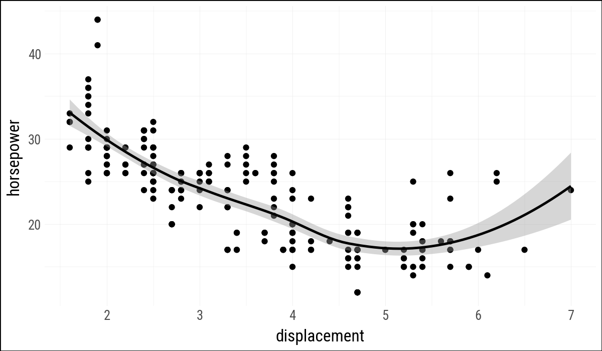
mpg = pl.from_pandas(mpg)(
mpg
.ggplot(aes(x="displ", y="hwy"))
.geom_point()
.geom_smooth(method="loess")
.labs(x="displacement", y="horsepower")
)